
Methods to Get Smarter at Visual/UI Design, Color Contrast Checker, Product Mockup Templates, Buy Me A Coffee
Edition #003 Of Design Insight

Hello and welcome back to the newsletter 👋
Before we start:
Have something you want to recommend?
A landing page or no-code product design you'd like me to review
A design tool or resource you use often
A web article that explains some aspect of design well
DM me over on Twitter and if your recommendation is included I'll mention you in the newsletter.
3 Design Library Items
Article - 7 Easy and Productive Methods to Get Smarter at Visual/UI Design
Author: Dawid Tomczyk
Source: UX Collective
Here's what I learned from reading this article:
Design patterns are useful to refer to as they outline industry standards for solving a problem. This means you don't have to come up with a new creative solution for that problem, you simply do what has been done before.
Create an inspiration library of great designs.
Use this library to copy great designs so you can improve your own design skills.
Link To Article: 7 Easy and Productive Methods to Get Smarter at Visual / UI Design
WebAim Color Contrast Checker
If you read last week's newsletter you'll remember I referenced the following UI Design Tip: Ensure Text Color Contrast Is Readable.
One easy way to check your color contrast is with a color contrast checker.
The WebAim color contrast checker does just that. I recommend you bookmark this tool to use with your next design project.
Mockups-design.com - Product Mockup Templates
If you've created a digital product like an eBook, a great way to set yourself apart from others is to create a product mockup.
The product mockup is a digital representation of your product that can work really well on your Gumroad page or help to promote your product on social media.
Mockups-design is a great free resource I've found for product mockup templates.
2 UI/UX Design Tips
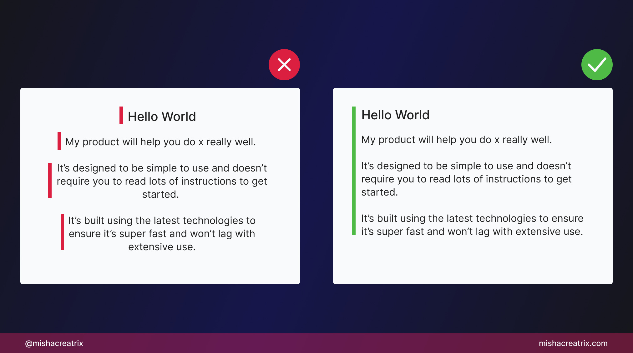
Avoid Centering Text
Avoid centering text on websites.
Centered text adds to the user's cognitive load as it requires more processing power to read.
Each line of text starts in a different place. This is called a ragged edge.
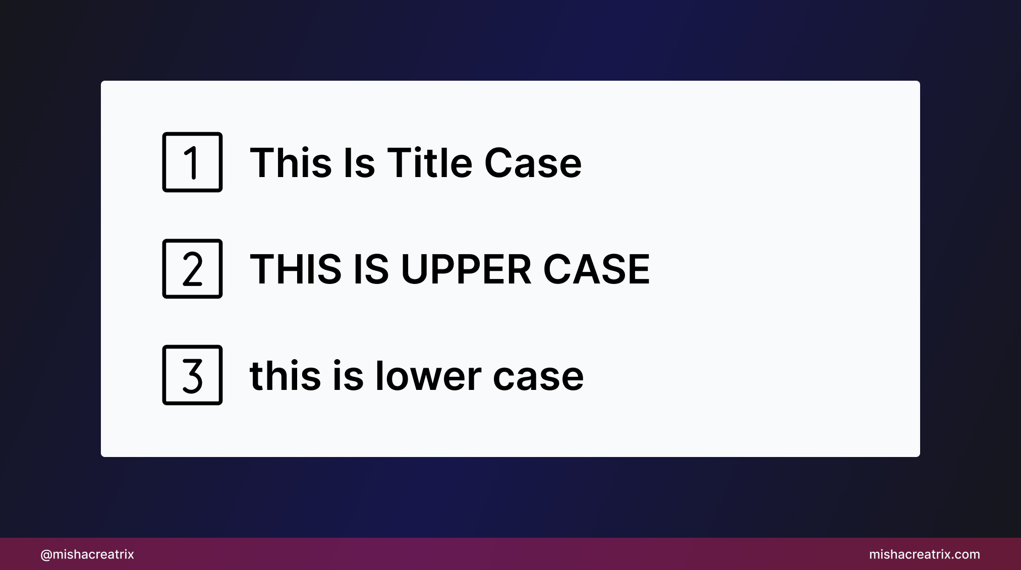
Capitalize Headings Consistently
Capitalize headings consistently. Pick one format and stick to it in your design.
Examples of capitalization:
This Is Title Case - the first letter of each word is capitalized
THIS IS UPPER CASE - all upper case
this is lower case - all lower case
1 UI/UX Review
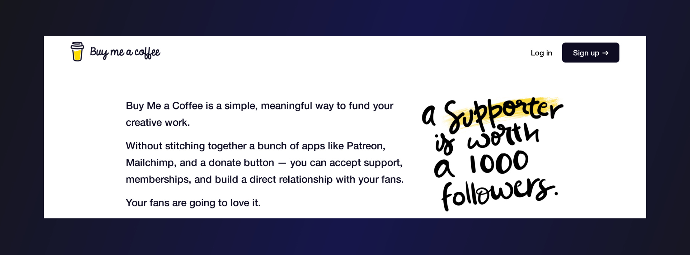
How Buy Me A Coffee's Hero Encourages You To Get Started
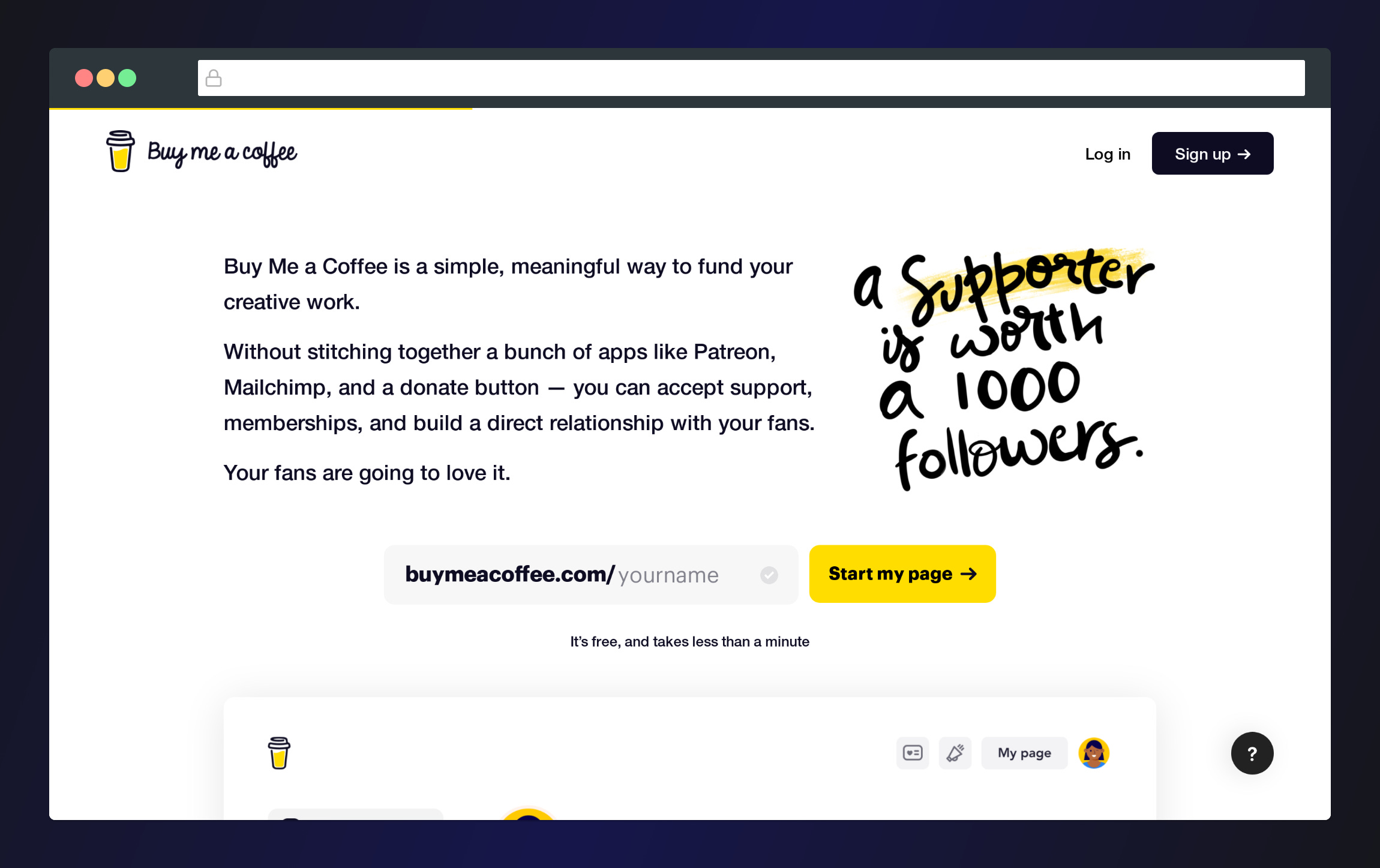
This week, let's look at the hero section of the Buy Me A Coffee landing page; specifically the hero section.
I want to break down each component to show you how this design encourages users to start using their service.
We'll look at 3 aspects in particular:
Clear and concise use of copy
A start now component to encourage plug and play
A small teaser of live functionality to pique your interest
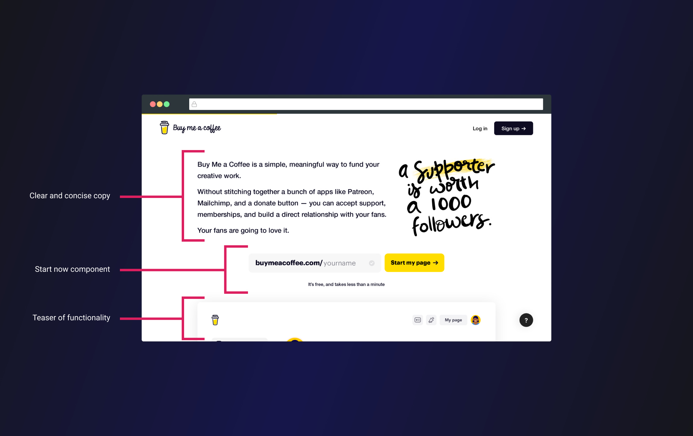
1 Clear and concise copy
The hero section gives you the who, what, why, and how in 3 easy to read simple sentences.
The first sentence describes what you'll get from this service "a simple, meaningful way to fund your creative work".
The second sentence describes how simple it is to use compared to other solutions.
The third sentence hits you with a positive and emotional appeal "Your fans are going to love it"
As well as that there is a stylized phrase that inspires you to get started building your audience of supporters.
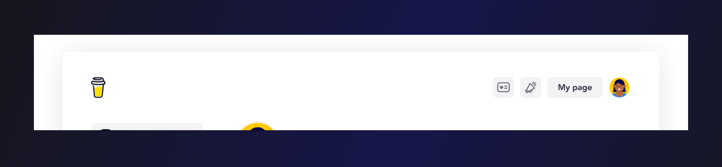
2 Start now component
The start now component as I'm calling it encourages you to create your page immediately.
It's similar to filling out your email address when signing up for an email newsletter for instance.
In this case, you can create your page by entering a name and selecting Start my page. This is much faster than creating an account, filling in lots of information, setting up your page from scratch, etc.
What's more, at the bottom of this component you'll see text that says "It's free, and takes less than a minute".
The emphasis on free and the speed with which you can get set up would encourage almost anyone to sign up if they were hesitant, providing this is actually the case of course.

3 Teaser of functionality
It's always a good idea to include live screenshots, gifs, or videos that showcase your product or service in action.
In this case, the specific positioning of the screenshot at the bottom of the hero encourages users to scroll down to see more.
This is a pretty useful trick to add to your toolkit 😉
TL;DR For a landing page hero that converts:
Use simple, clear copy.
State the benefit of your product over the competition.
Make it super easy for a new user to get started.
Clearly state the price upfront - don't hide this information.
Include screenshots, gifs, videos of your product in action.
If you would like to support my creative work you can do so over on Buy Me A Coffee. Let me know if you’d also like a shoutout on the newsletter 🥳
You’ve reached the end of this week’s edition of the Design Insight newsletter. Thank you for reading, I truly hope you found value in the insights I shared today.
Til next week 👋
Michelle