

Paradox Of The Active User, Color Contrast, Poor Font Choice
Paradox Of The Active User, Color Contrast, Poor Font Choice
Edition #002 of Design Insight

Hello there and welcome back 👋.
Before we start:
Have something you want to recommend?
A landing page or no-code product design you'd like me to review
A design tool or resource you use often
A web article that explains some aspect of design well
DM me over on Twitter and if your recommendation is included I'll mention you in the newsletter.
Let’s get into the newsletter.
3 Design Library Items
Article - Paradox Of The Active User
Author: Jakob Nielsen
Source: NNGroup.com
Here's what I learned from reading this article:
The paradox of the active user is basically that the user never reads the manual. They would rather get started using something immediately.
This is a paradox because the user would end up saving time if they spent some initial time reading the manual.
Because of this paradox, it's important for designers to design for the way users actually behave i.e. irrationally.
Link To Article: Paradox Of The Active User - NNGroup.com
Sharpen.design - Design Challenge Generator
The number one way to improve your design skills is to design things. To actually put your skills into practice.
One way you can do this is with design challenges. A randomly generated design challenge that you work on.
That's just what the Sharpen Design Challenge Generator does.
Try it out and set yourself the goal of completing one design challenge a week to improve your design skills.
Lapa - Landing Page Design Inspiration
Another excellent way to improve your design skills is to look for inspiration.
By picking out aspects of designs that you like, you can combine them to create something unique but still visually appealing.
Lapa is a curated website of landing page designs that's perfect for gathering inspiration.
Save designs that look striking to you and learn to understand why you like them.
Is it the color palette that stands out? Or perhaps it's the use of graphics or illustrations that catches your eye.
This is how you train yourself to create better designs.
2 UI/UX Design Tips
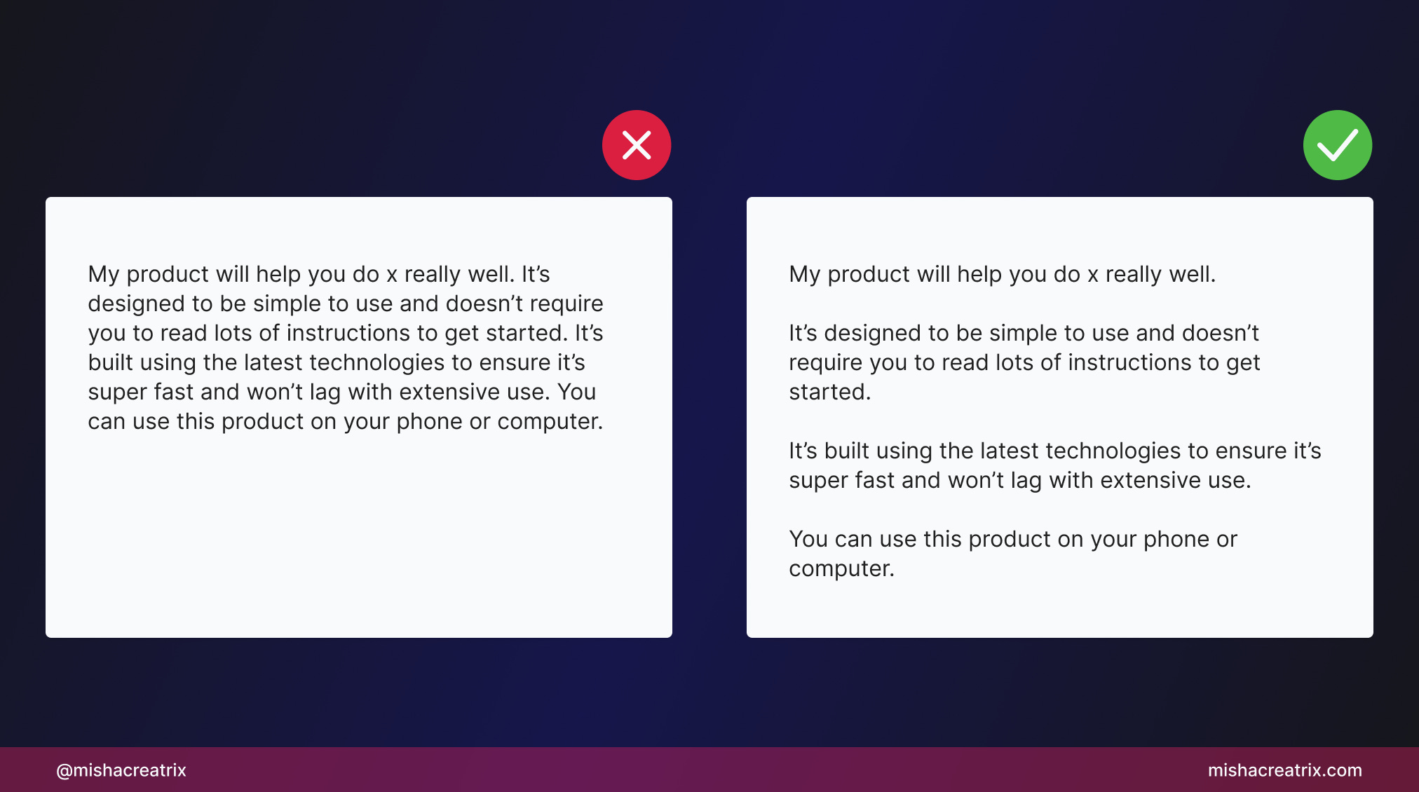
Use Short Paragraphs
Users don't read content, they scan.
Most people are simply scanning for what they're looking for. As a result, they don't read most of what's on-screen.
With this in mind, it's important to structure your copy into short paragraphs.
This helps the user to scan your content
Rule of thumb: Keep one paragraph per idea.
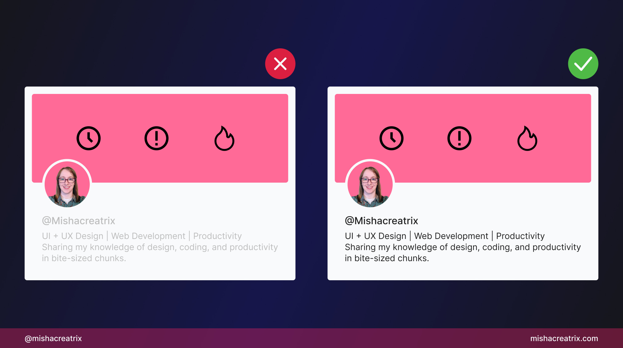
Ensure Text Color Contrast Is Readable
One immediate way to improve your designs is to make sure the text has enough contrast with the background.
People need to be able to comfortably read the content on screen.
If the text color blends in with the background, the user will have to squint and concentrate on each word to identify what's written down.
Increase the contrast between text and background color and it will make things easier to read.
Tip: use a color contrast checker to make sure your designs are easy to read.
1 UI Review
How Wild Wild Country Ruined Me With Their Choice Of Font

I recently started watching Wild Wild Country on Netflix; a true-crime documentary about Bhagwan Shree Rajneesh and his group of followers.
You might be wondering what this has to do with UI so I'll cut to the chase.
The style of font used is simply unreadable.
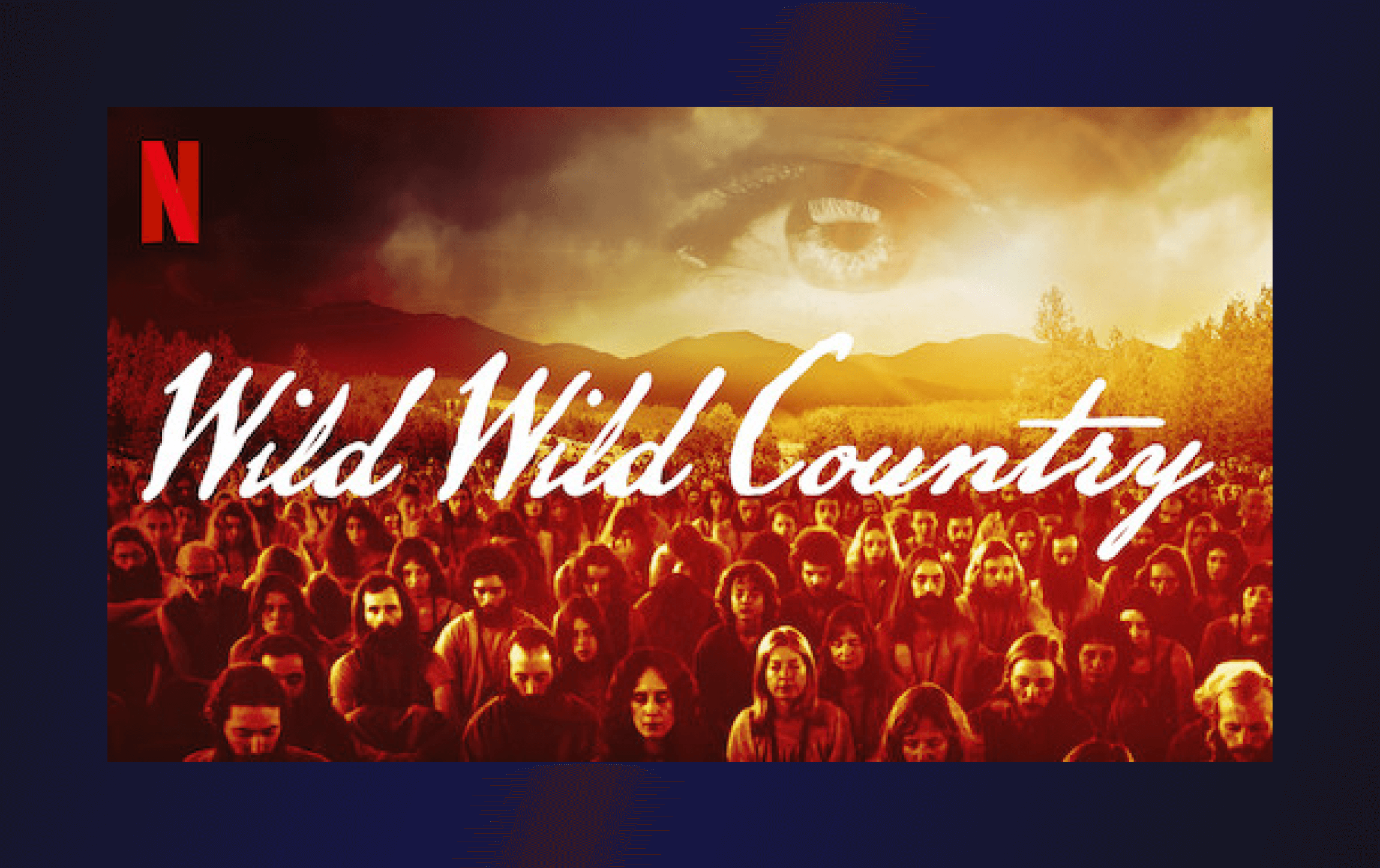
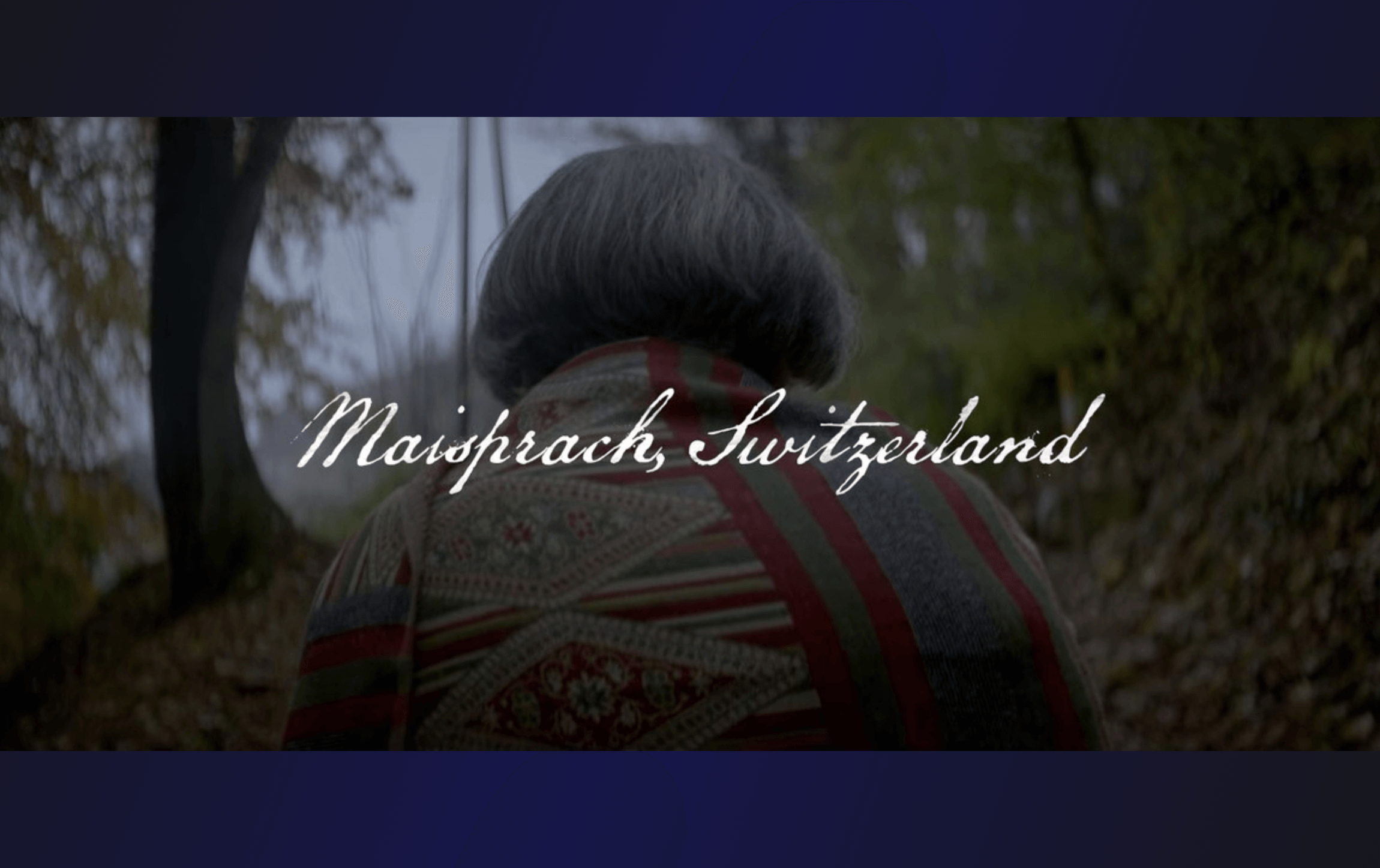
If you look at the cover art for this show, the font used there is the same throughout the show.
This means that people's names, dates of events, and other important info shared through text is all written in this hard-to-read font.
As a result, I was forced to pause the show every time a piece of text floated onto the screen to try and decipher it. The amount of brain processing power I needed to read the words took me right out of the storytelling.
By the end of the first episode, I still felt like I was missing key pieces of information which was extremely frustrating.
This brings me to my point: text needs to be clear enough to display information.
People don't particularly care about your cool font style, they want to know what is being said.
Stick to clear and simple fonts when you're trying to convey information and leave the cool style choices to the cover art or logo design.
If you think I'm going overboard with disliking this font choice, check out this article by Brian Moylan from Vulture that echoes my feelings:
TL;DR
My advice for picking fonts:
People need text to display information clearly.
Stick to clear and easy-to-read fonts - You can't go wrong with Google fonts.
Keep decorative fonts to logos, cover art, and posters.
You’ve reached the end of this week’s edition of the Design Insight newsletter. Thank you for reading, I truly hope you found value in the insights I shared today.
Til next week 👋
Michelle