
A framework to make design decisions, Laws of UX, DrawKit, 404 pages, button hovers, how DrawKit's landing page builds trust
Edition #004 of Design Insight

Hello and welcome back to the newsletter 👋
Before we start:
Have something you want to recommend?
A landing page or no-code product design you'd like me to review
A design tool or resource you use often
A web article that explains some aspect of design well
DM me over on Twitter and if your recommendation is included I'll mention you in the newsletter.
3 Design Library Items
Article - A framework to make great design decisions
Author: Chris Lee
Source: UX Collective
Here's what I learned from reading this article:
As a UI/UX designer, your value comes from making good design decisions. If design could be automated there would be no designers!
To make critical decisions you need to break the problem down into first principles, then make a decision based on the expected value.
Expected value is a way of making a decision without all the information. To do this you determine the impact of each of the options and multiply that by your guess as to how likely it is to occur.
Link To Article: A framework to make great design decisions
Laws of UX
Laws of UX is an excellent resource created by Jon Yablonski.
It contains a vault of UX best practices that are helpful to know when designing interfaces.
Each Law, Heuristic, and Cognitive Bias is laid out in a visual and easy-to-understand way.
I recommend you bookmark this resource and read one entry a day to develop your UX skills.
DrawKit
As someone that's trying to incorporate more illustrations into my designs, I'm always on the lookout for great resources.
DrawKit features a repository of excellent hand-drawn illustrations.
There are premium illustration packs on offer but the free ones are perfect if you're getting started.
Psst - DrawKit is also the featured design in this week's UI review down below 👇
2 UI/UX Design Tips
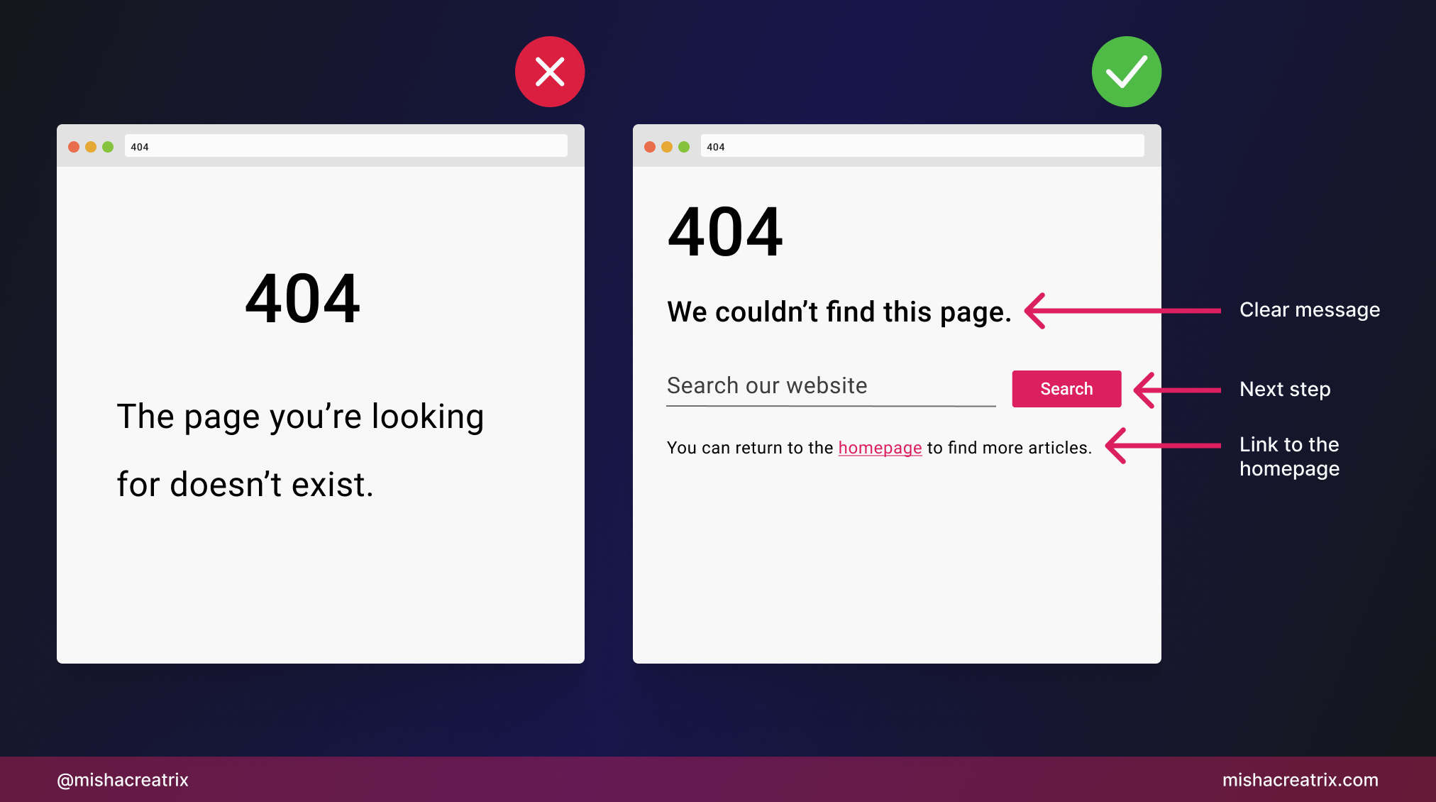
Don't leave the user stranded on a 404 page
Don't forget to customize your 404 page. That is the page that's shown when someone tries to access a URL that doesn't exist.
Here's the formula for a good 404 page:
Clarity - clearly explain what happened to the user
Next step - give an obvious call to action so the user can continue using your site
Link to homepage - include a link to the homepage so the user can start over
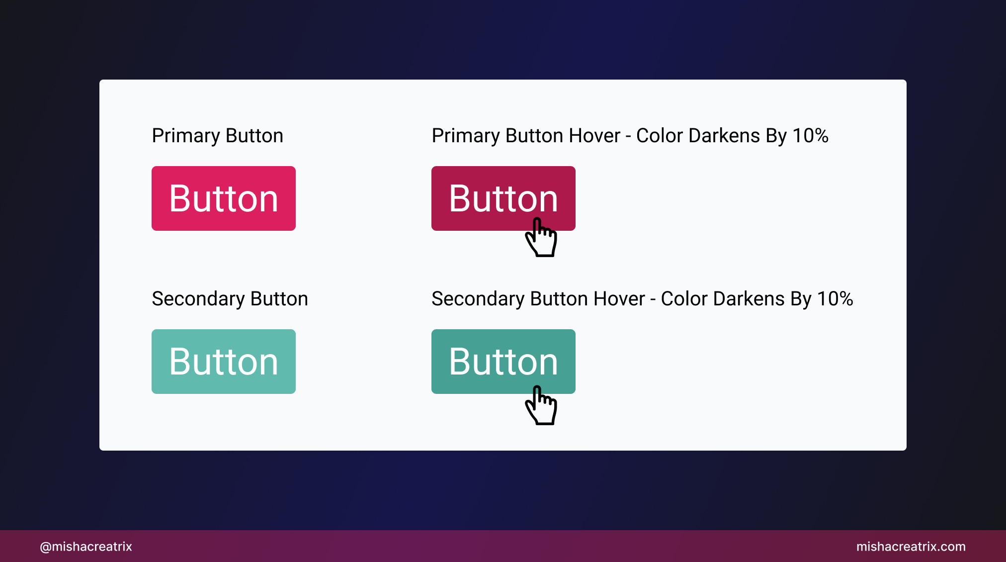
Style button hovers consistently
Be consistent with how you style button hover colors
If you darken a primary button on hover, do it for all buttons. This creates a sense of consistency.
Don't lighten one button on hover then darken another button.
1 UI/UX Review
How DrawKit's Landing Page Builds Trust With New Visitors
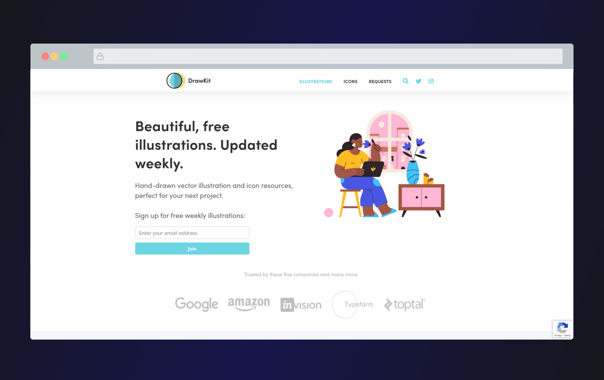
Last week's edition that featured Buy Me A Coffee's landing page was well received so let's continue that momentum with DrawKit!
I'll break down each aspect of the hero section of DrawKit's landing page and show you how this design builds trust with new visitors.
We'll concentrate on these 4 aspects:
Simple headline
Sign up option
Brands build credibility
Sample illustration in action
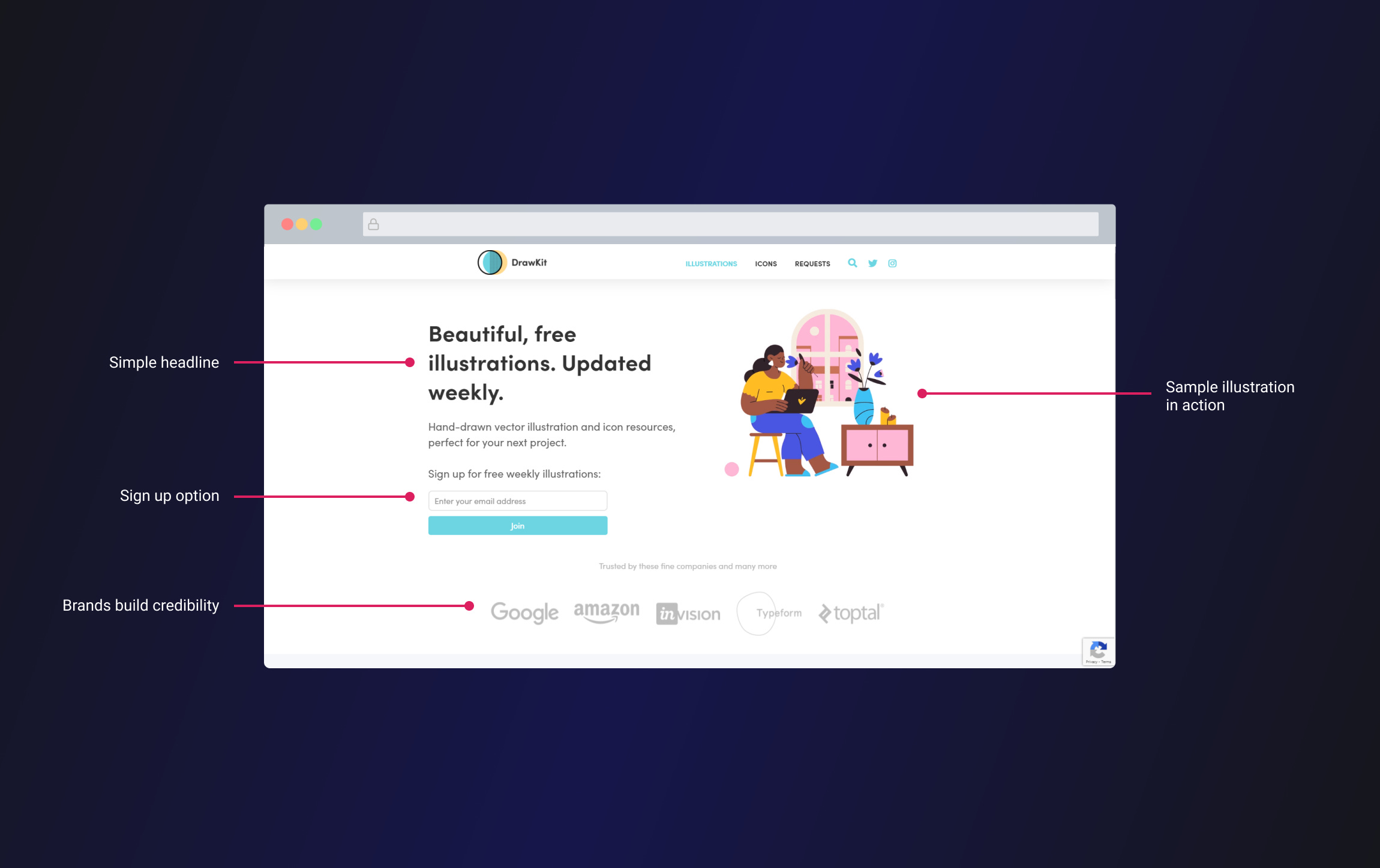
1 Simple headline

The headline "Beautiful, free illustrations. Updated weekly" is simple but it says a lot:
You're getting high-quality illustrations. People want professional quality components for their websites.
They're free. People want to know the cost of something upfront.
They're updated each week. People want current and up-to-date components, not old and outdated ones.
As you can see we were able to get a lot from 2 very short sentences.
The sub-headline expands further to tell you what you get and how you could use these illustrations:
"Hand-drawn vector illustrations and icon resources, perfect for your next project".
Here's what we learn from this sentence:
They're hand-drawn. This will create a unique aesthetic for someone's website.
Vector-based illustrations. These are ideal to work with as they scale and resize well.
Illustrations and icons. They have multiple uses, not just as accompanying imagery.
Perfect for your next project. These resources could be used in any type of project you're working on.
Again, we can tease a lot from a clear, concise sentence like this one.
2 Sign-up option

The sign-up option as I'm calling it is a great idea for a site like this that offers design resources.
It acts like a read-it-later feature where you can have the content sent directly to your inbox.
This can be helpful if you don't have the time to scour the website to find a particular illustration.
With that said, it's not clear how many people are on this mailing list. Including the number here could increase their credibility further.
3 Brands build credibility
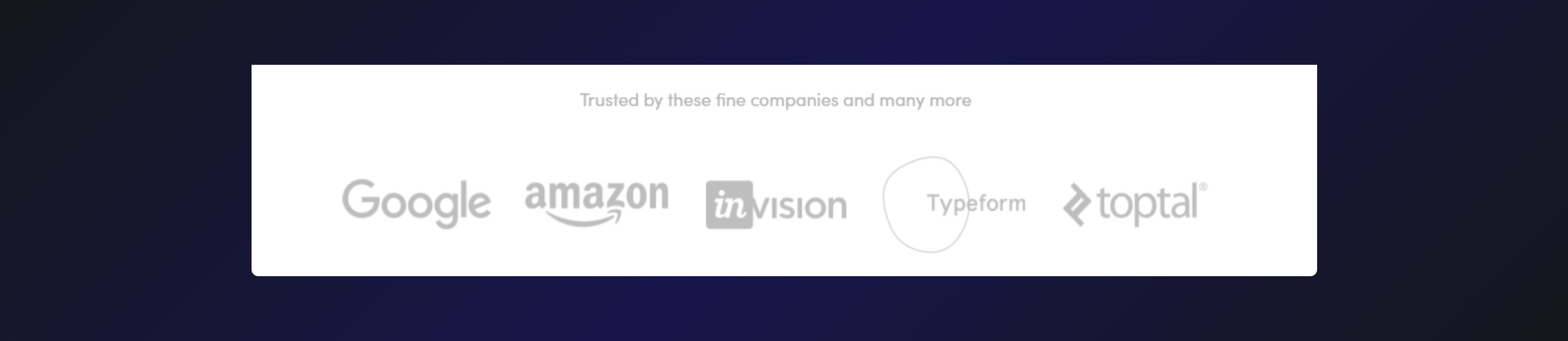
Including a list of brands like this that use your product is a great way to build credibility. Having it in the hero section also makes it a prominent feature of the landing page and one of the first things you see.
If companies like Google and Amazon are using these icons, they must be worth using.
I'd also be interested to see where companies like Invision, Toptal, and Google actually use these icons. This could be a dedicated page to further build credibility as well as provide inspiration to new users.
4 Sample illustration in action
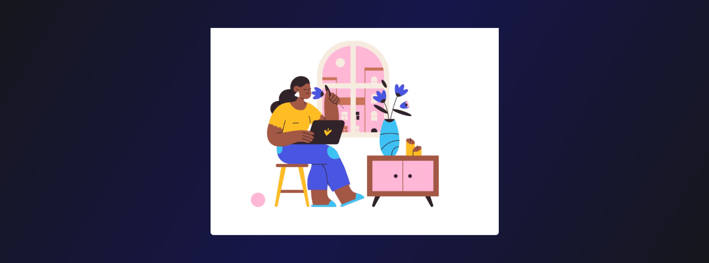
This is fast becoming a common theme among the landing pages I review but it is worth repeating.
Show your product in action.
The hero section here features a beautiful illustration that animates and changes every few seconds.
This perfectly showcases how these illustrations can be customized and used.
From a design perspective, it also adds visual interest to the page as my eyes were immediately drawn to it after reading the headline.
TL;DR
To design a landing page that builds trust with your audience:
Have a clear, concise headline and sub-headline
Give users the option to read it later
Include trusted brands that actually use your product to build credibility
Showcase your product in action
If you would like to support my creative work you can do so over on Buy Me A Coffee. Let me know if you’d also like a shoutout on the newsletter 🥳
You’ve reached the end of this week’s edition of the Design Insight newsletter. Thank you for reading, I truly hope you found value in the insights I shared today.
Til next week 👋
Michelle