
The humanual, impossible checkbox, iPod.js, 2 UI/UX tips, understanding the Software Ideas landing page
Edition 011 Of Design Insight

Hello and welcome back to the newsletter 👋
Since the last edition, I published a new project on Gumroad: Twitter Posting Schedule Printable. Feel free to check it out if you're interested.
Let's get started.
3 Design Library Items
Article - The humanual
Author: Ben Issen
Source: Supercreative
Here's what I learned from reading this article:
Humanuals describe how we work. They are useful documents for collaboration.
If we know who we're talking to, we spend less time figuring out who they are and more time doing the work.
These "how to work with me" documents can be helpful to create and share with colleagues or anyone you work with.
Link To Article: The Humanual
Impossible Checkbox
I'm not giving you any context for this one, just check it out 😉
iPod.js
I think I came across this fun project on Twitter.
Someone has recreated an iPod touch in the web browser.
Worth checking out if you're interested in some nostalgia.
2 UI/UX Design Tips
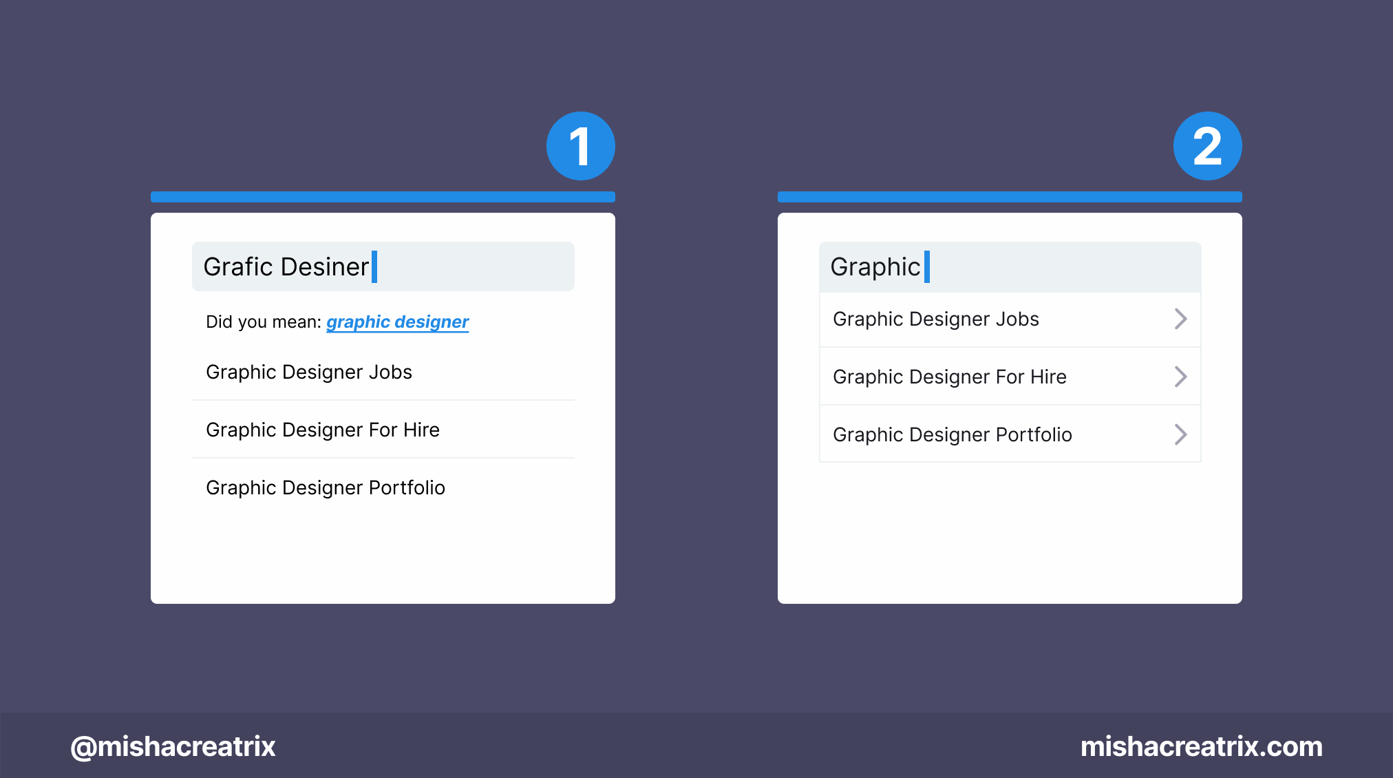
Design For Zero Search Results
When designing for search, consider a case where 0 results are returned.
You don't want the user's flow to stop dead so you need to provide them with next steps.
Suggest corrections
Account for typos with autocorrect
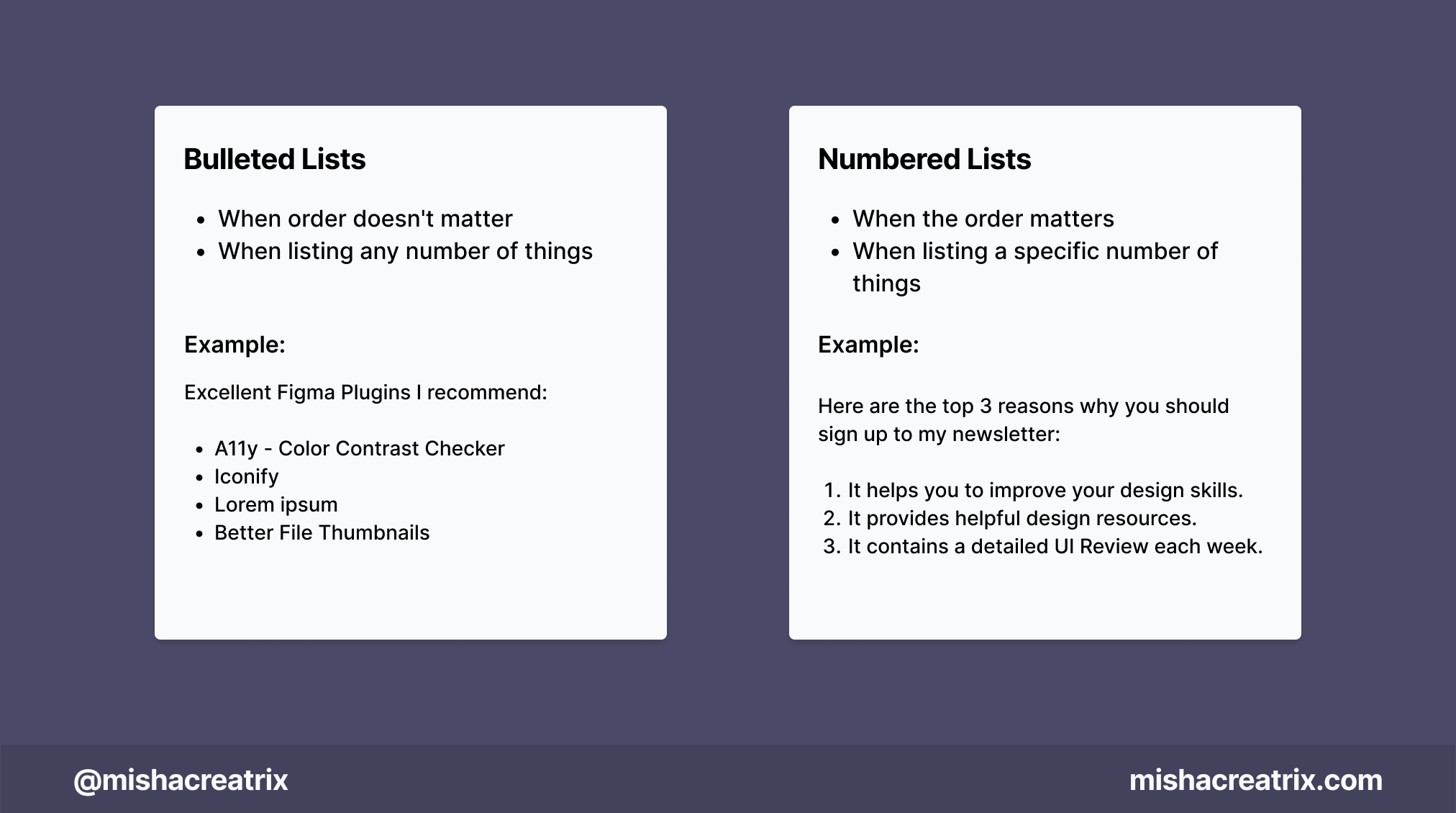
Numbered Lists Vs Bulleted Lists
Use a numbered list:
when the order matters
when listing a specific number of things
Use a bulleted list:
when order doesn't matter
when listing any number of things
Example of a numbered list:
Here are the top 3 reasons why you should sign up for my newsletter:
It helps you to improve your design skills
It provides helpful design resources
It showcases a detailed UI Review each week
Example of a bulleted list:
Excellent Figma Plugins I recommend:
A11y - Color Contrast Checker
Iconify
Lorem ipsum
Better File Thumbnails
uiGradients
Illustrations
Design Lint
1 UI/UX Review
Understanding The Software Ideas Landing Page
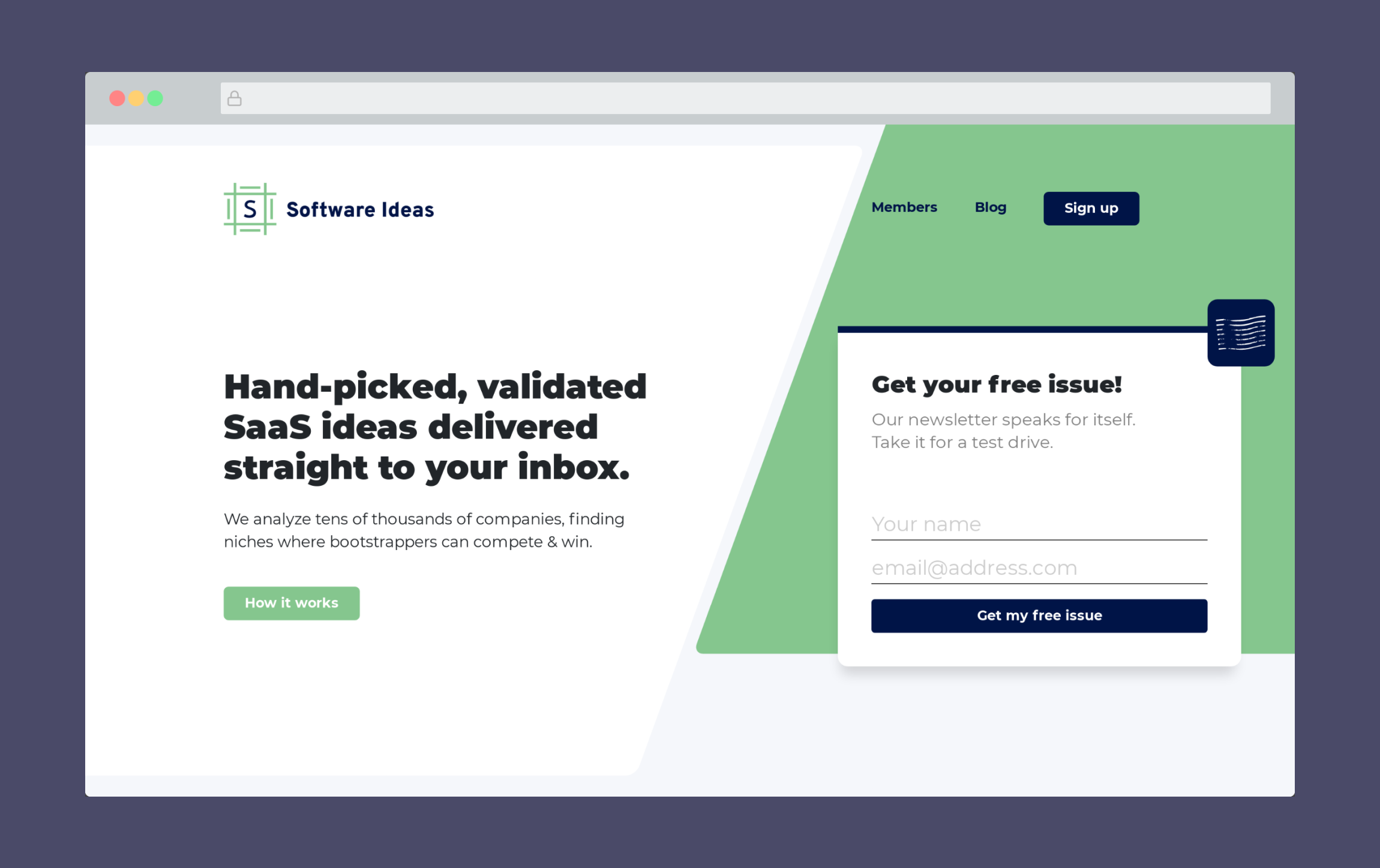
Software Ideas is a website that gives you SAAS business ideas.
They examine all kinds of companies and share insights into niches that have little competition.
There's much more to it than that, but for this UI/UX review, I want to examine the Software Ideas landing page.
Let's look at how it's designed, what's effective, and what could be improved.
1 Use of Color
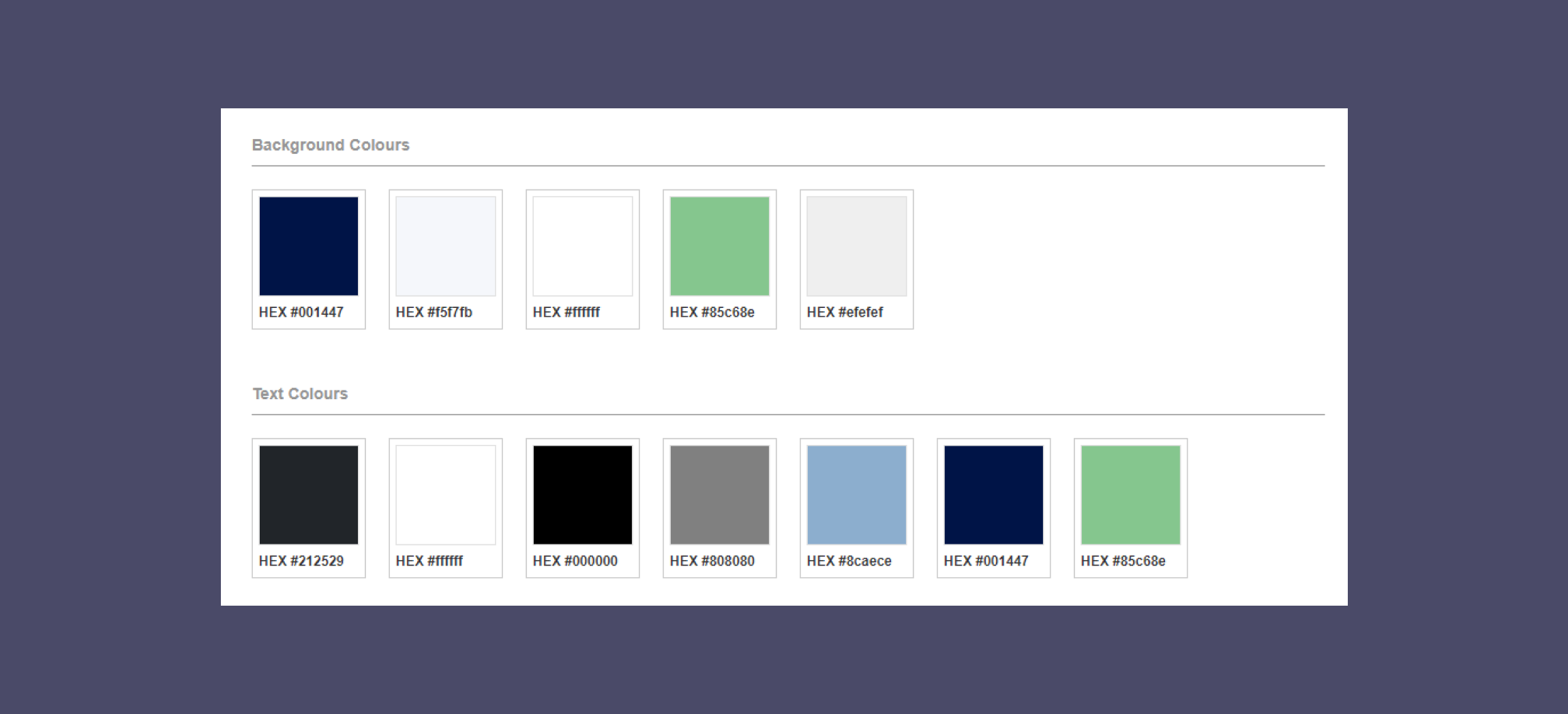
The main colors used on this landing page are green, dark blue, and a lighter blue. Shades of black and white are also used for background colors and text colors.
This is a great example of an Analogous color scheme. The colors used: blues and greens, are found beside each other on the color wheel.
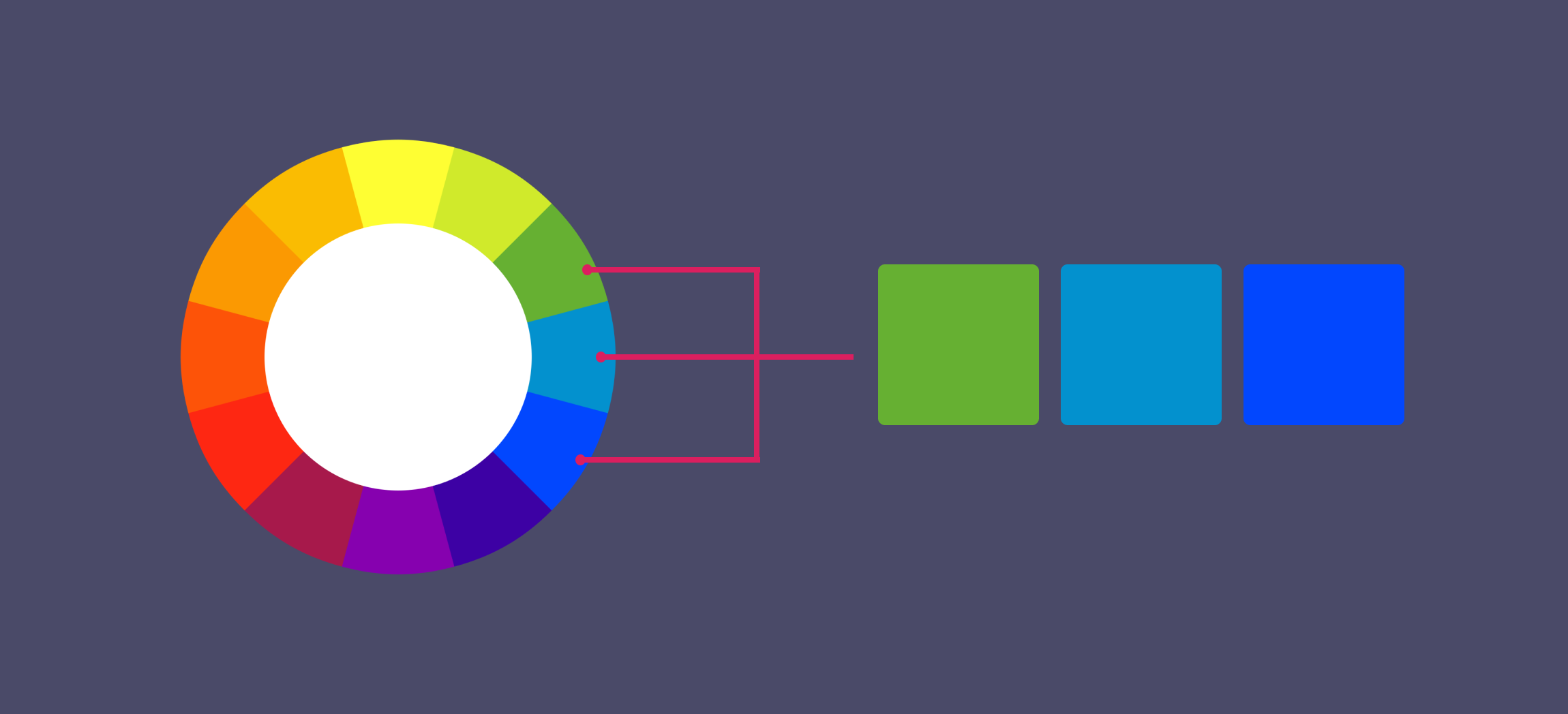
This is also an excellent example of a color scheme with more than 2 colors.
When I create a color palette for a website, I tend to lean towards a simpler palette of 1 - 2 colors with shades of black and white.

I keep things simple and advise people new to design to do the same in the beginning.
However, once you become more comfortable, you can add more into your color palettes like the Software Ideas landing page does.
Just one extra color adds a bit more depth to the design which to me indicates you know what you're doing.
If you're looking to try and create a more complex color palette for yourself, I recommend using Adobe Color.
It will also help you to become more familiar with the color wheel and how it operates.
2 Multiple chances to sign up - Subscribe, subscribe, subscribe
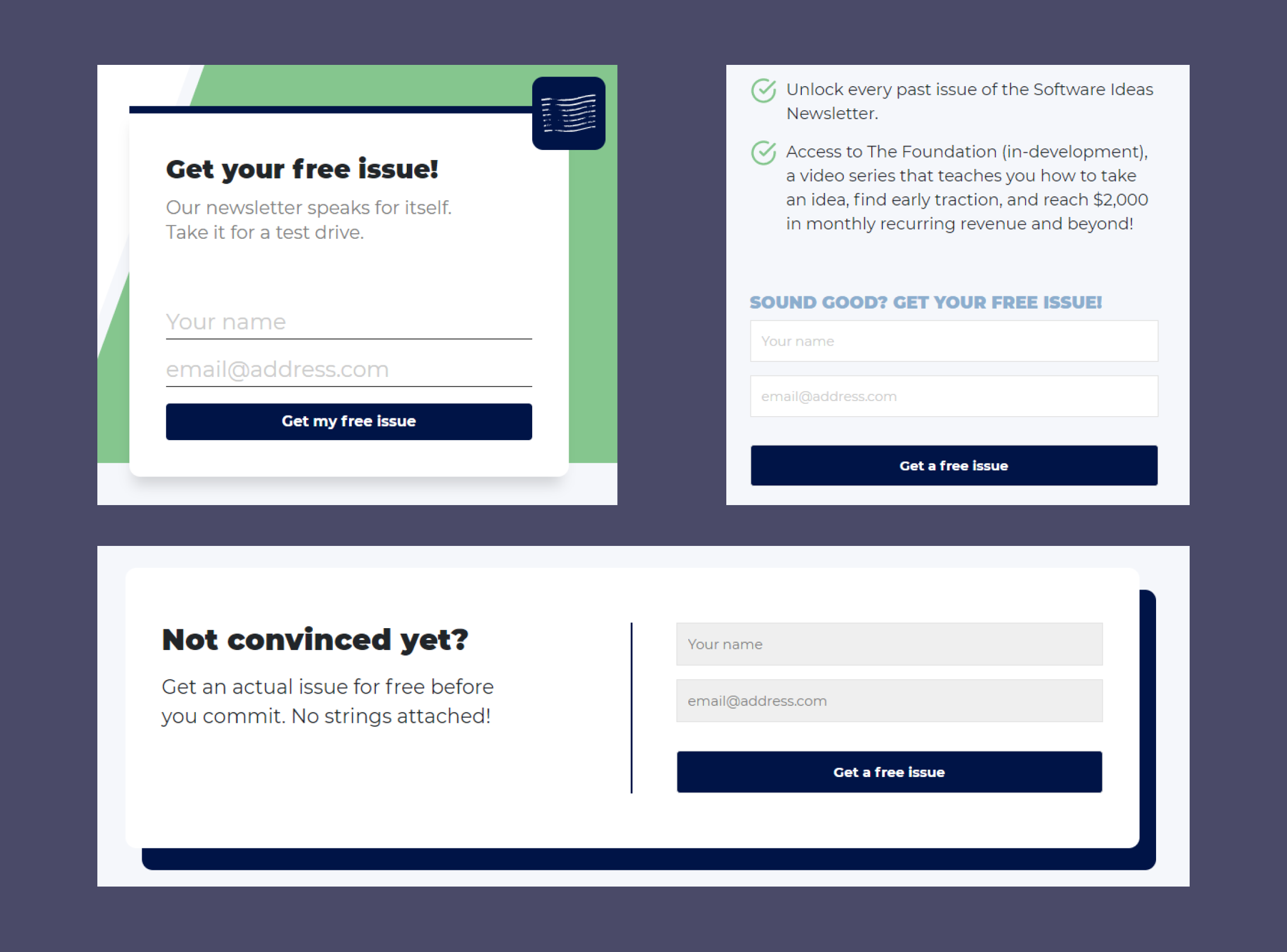
If you take a look at the Software Ideas landing page you might notice there are lots of calls to action.
In particular, the free issue newsletter sign-up option is featured 3 times on the landing page alone.
The repetition of this sign-up call to action does a good job of encouraging the user to sign-up and get their free issue of the newsletter.
Each sign-up is placed in a key section of the landing page to capture the user's attention:
A. The first instance is right after the hero section.
By this point, the user knows what the product is. It's reasonable to assume their next thought would be 'can I see this content in action?'. In which case, the newsletter sign-up is perfectly placed.
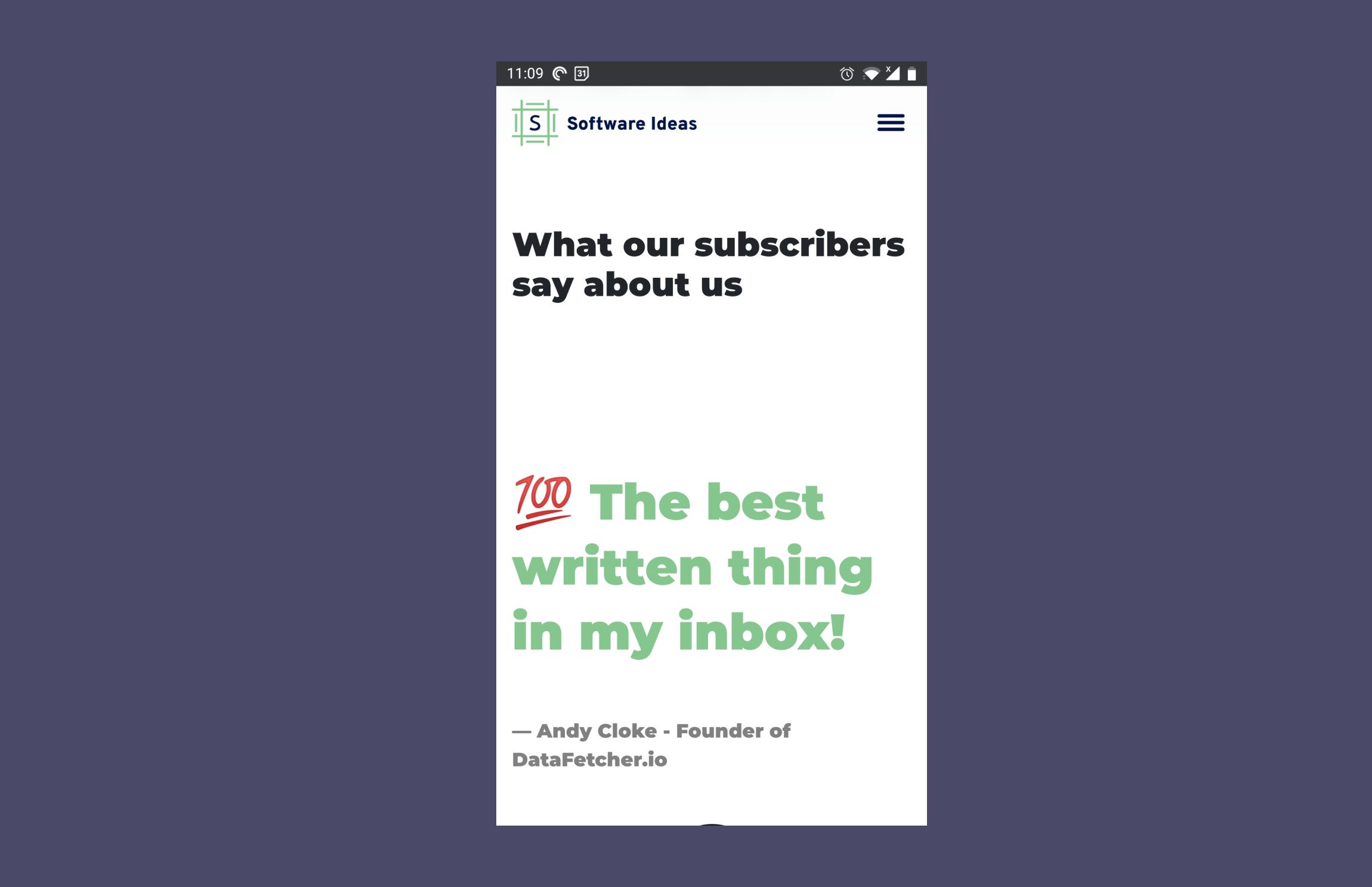
B. The next instance is mid-way down the page underneath a testimonial.
By now the user knows more about what's on offer and will find the product more credible having read a well-crafted testimonial.
Another key place to include the call to action.
C. The third instance is at the bottom of the page.
If the user has made it this far, they have read all the copy on the page.
Placing the final call to action here gives them a next step to take. This one is important because you never want to leave the user stranded on a page with nowhere to go.
Depending on the size of your landing page I wouldn't repeat the same call to action more than 3 times as this might put the user off.
In the case of the Software Ideas landing page, you can see the CTA is included at the start, middle, and end of the page. Something to keep in mind.
Note: The best way to understand how your landing page is used is with analytics and user testing.
3 Use of White space
First a bit of theory:
White space is the area of space between content on a web page. It can also be called negative space.
Positive space is used to refer to the content on the page. The text, the imagery, etc.
Making use of positive and negative space effectively creates a visually appealing web page. When done incorrectly, a web page can look cluttered.
Ok, so with the theory covered, let's look at the Software Ideas landing page in relation to white space.
To make things a little different I'll look at this aspect on a mobile screen. (For my review purposes I used my One Plus 5 phone)
Mobile devices are becoming the most used way for people to access websites so it's not something that you can afford to ignore.
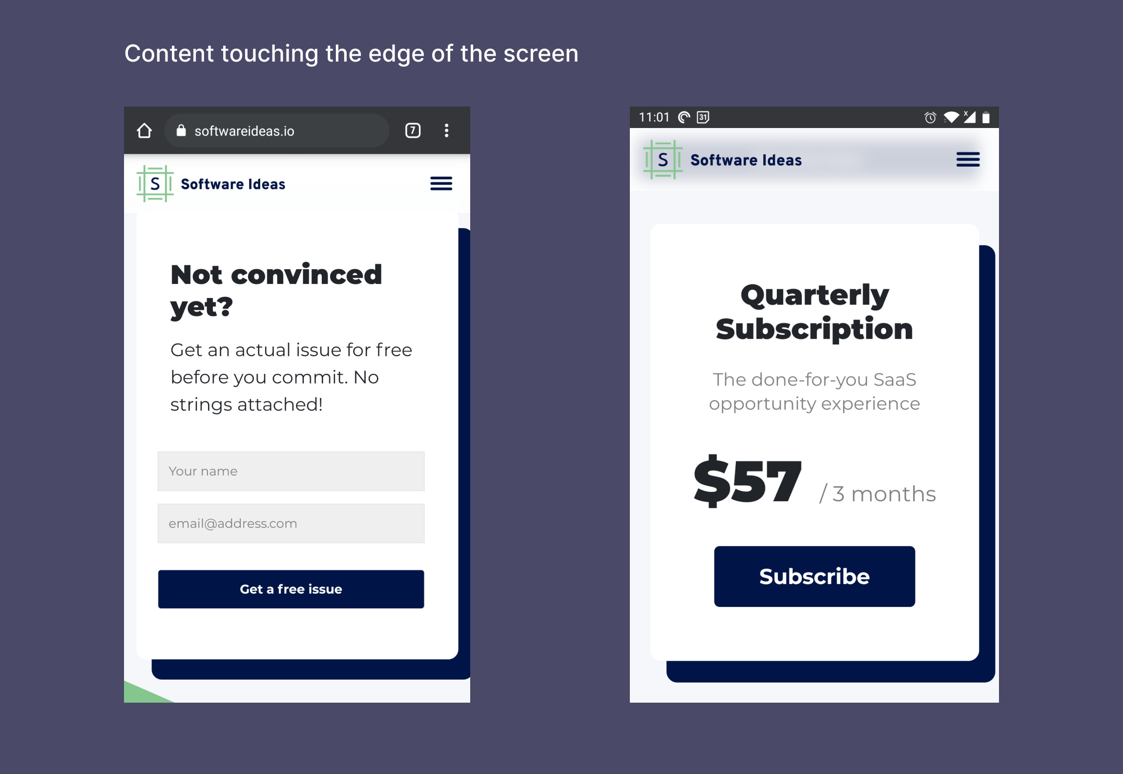
The most important way to make use of whitespace on mobile is to ensure the content is brought in from the edges of the screen.
I'll call this horizontal spacing.
You should have at the very least 8 - 16 px (.5 - 1 rem) of padding left and right to prevent text and images from touching the edges.
This is done effectively on the Software Ideas landing page overall.
With that said, there are a few areas where the content touches the sides including the Quarterly Subscription box and the final CTA box.
Also important to horizontal spacing is the alignment of content.
On a mobile screen, it's more visually appealing to have content aligned to the center.
I'm not talking about text alignment here, I'm talking about the space between the left and right sides of a content box. This should be equally spaced between the left and right sides of the screen.
The testimonial section does this very well as an example.
Some areas like the CTAs are misaligned when compared to the rest of the content.
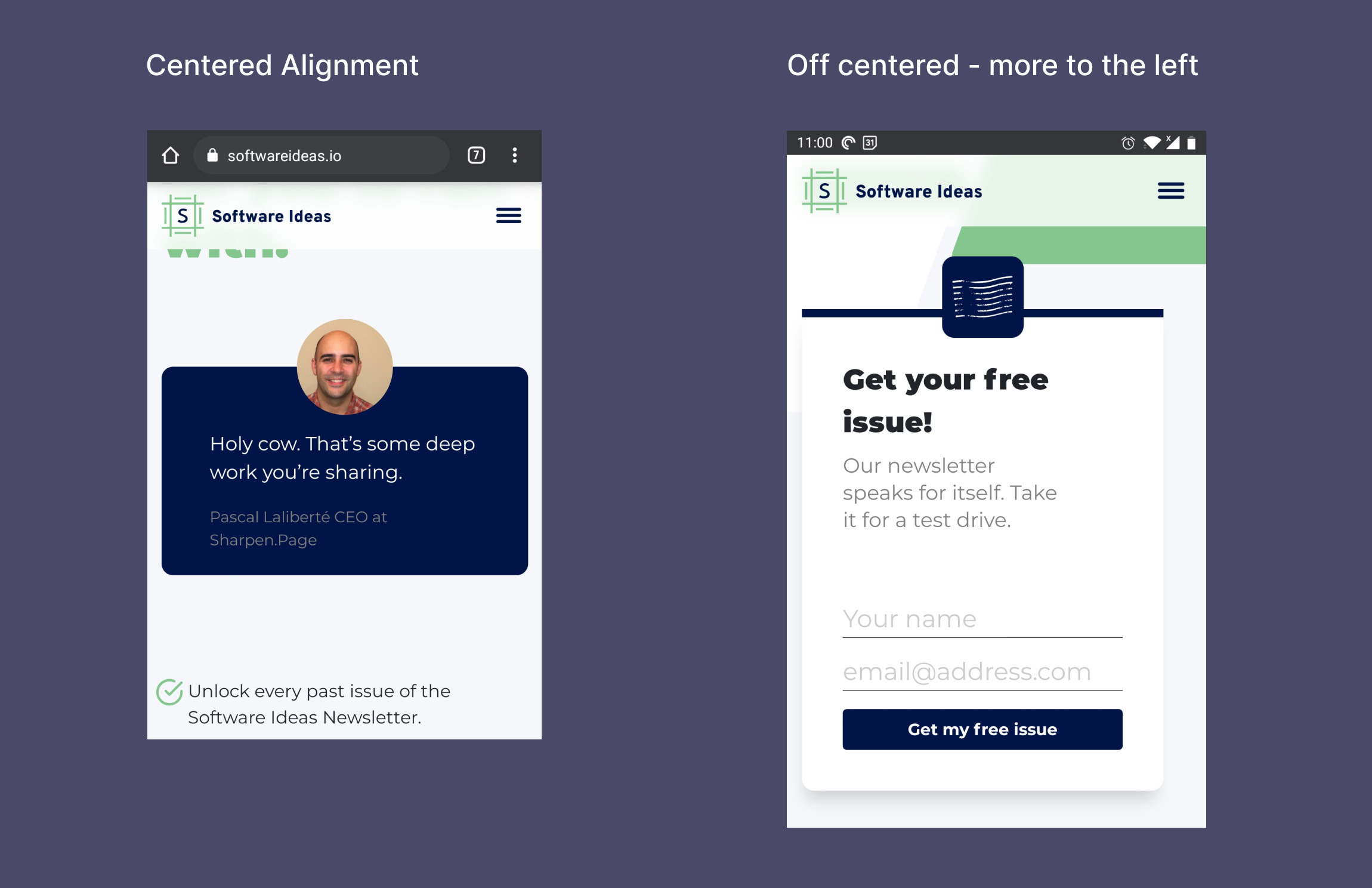
I can't say if this is down to my mobile specifically but something like that is enough to catch my eye as an issue.
The final point I want to touch on related to white space is vertical spacing. The space between content from top to bottom.
As you test out your designs on mobile it's important to consider how much space is between components.
This can differ between desktop and mobile so it's something you'll likely have to tweak.
An example of this is the 'What our subscribers say about us' section. Do you think this is too much space or not enough space?
As you can see from what we looked at today, white space is something important to consider when designing and building a website.
If done well it creates a pleasing design, if done not-so-well it creates a sense of imbalance.
If you want to learn more about whitespace here's a short essay I wrote:

TL;DR
Start with a simple 1-2 color palette and add more when you're comfortable with the color wheel.
Include multiple calls to action on your landing page to catch the user's attention at critical points in their journey.
Always examine your website on mobile to make sure content is brought in from the edge of the screen.
If you have something helpful you'd like included in the newsletter, DM me over on Twitter.
If you would like to support my creative work you can do so over on Buy Me A Coffee. Let me know if you’d also like a shout out on the newsletter 🥳
You’ve reached the end of this week’s edition of the Design Insight newsletter. Thank you for reading, I truly hope you found value in the insights I shared today.
Til next week 👋
Michelle