The difference between note-taking and note-making, 98.css, extractCSS, 2 UI/UX Design Tips, Understanding The 30 Seconds Of Code Website
Edition 012 of Design Insight
Hello and welcome back to the newsletter 👋
A big welcome to any new subscribers reading this newsletter for the first time. I hope you find some value here 🙂
Let's get started.
3 Design Library Items
Article - The difference between note-taking and note-making
Author: Anne-Laure Le Cunff
Source: Ness Labs
Here's what I learned from reading this article:
Note-taking is the traditional way we have learned to take notes. We quickly jot down notes as someone is speaking and use their language. This content is easily forgotten.
Note-making is a more effective way of keeping notes. You deliberately craft notes in your own words using your own language. This more active way of taking notes allows you to better understand something and you're more likely to remember that information.
It's a good idea to connect your notes together to create a networked thinking model. This allows you to connect new ideas in interesting and unique ways you may not have previously considered.
Link To Article: The difference between note-taking and note-making
98.css
This is a cool project I came across for retro designers + developers.
It's a design system that recreates the Windows 98 UI.
If you're old enough to remember this it'll be quite fun to look at and maybe use.
extractCSS
This tool will take an excerpt of your HTML and extract the CSS from it.
Certainly more of a developer-type tool, but this can be particularly useful if you're pulling out the CSS from some old HTML code to try and make sense of how something is built.
2 UI/UX Design Tips
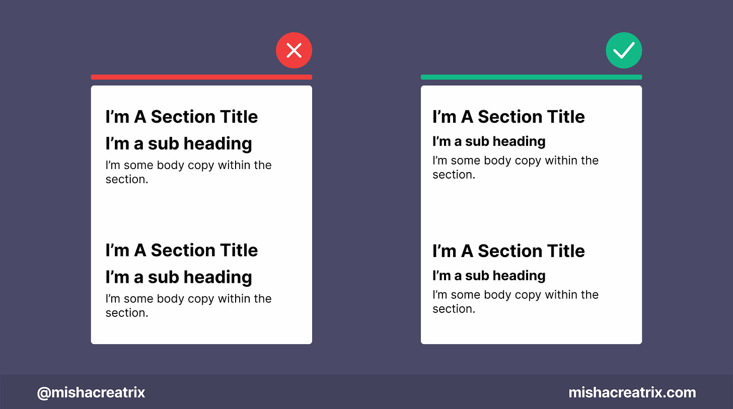
Text Hierarchy Is Important
The text in your design should follow a type hierarchy.
Headings, Sub headings, body copy should go from large to progressively smaller.
If your text doesn't follow a type hierarchy system, the reader won't know how the information on your site is organized.
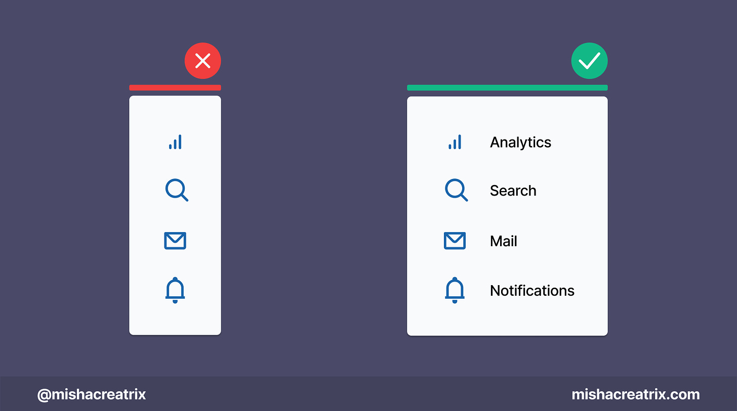
Include Labels With Icons
Add labels to your icons.
Unless you are Twitter or Instagram, you should add a label to your icons.
The user should 100% be able to understand what a menu item or a button means before they click on it.
1 UI/UX Review
Understanding The 30 Seconds Of Code Website
30 Seconds of Code is a website with a collection of short code snippets for different programming languages.
This type of website is different from the usual landing page type websites I look at but I wanted to mix things up.
Let's look at how this website is designed, what's effective, and what could be improved.
1 Search is easily accessible
One of the first things you'll see when you access this website is the search bar. It's prominently displayed in the top menu bar of the website.
This is especially helpful to include in a website such as this that contains a lot of content.
Using the search bar, users can easily search for a particular code snippet and retrieve it in moments as opposed to manually trying to find the exact code snippet by scrolling through each page.
Search itself is something we can take for granted because we use it every day with Google or Duck Duck Go.
However, we can forget to consider it when designing a website.
Unless your website is 3-5 pages of simple/sparse content you should consider adding search functionality.
Here are some quick tips for adding search to your website:
Search functionality should be consistently placed on every page. This will ensure it's easy to find.
Search should be easy to find on the page. In most cases, a search bar is included in the top navigation menu bar.
The Search input box should be wide enough to fit a typical search term.
If you want to learn more about the theory behind search, I recommend reading this article from NNGroup.com: Search: Visible and Simple
2 Use of Color
This website features a dark color palette which is again different from websites I've looked at until now.
I'm still learning a lot about what goes into creating a 'dark mode' color palette so this was a great opportunity to learn something new.
In the case of this website, there are 3 shades of black/blue-gray, white is used for text, and color is reserved for icons and code snippets.
Simple but effective.
The darkest black color is used for the top navigation menu to make it stand out.
The body background color is a slightly lighter color. It still has enough contrast with the white text in front of it which is important for easy reading.
A lighter color of the body background is used as the background color for each card/code snippet which does a great job of visually distinguishing each section.
Here again, there is still enough contrast to easily read the text.
Out of curiosity I ran these colors through a contrast checker tool and found that it passes perfectly.
Here's the tool I use to check color contrast: https://webaim.org/resources/contrastchecker/
In terms of the colors used, it looks like the colors match those used by each language.
For instance, the React Hooks collection uses the React logo and coloring. Another example is the Git collection which uses the Git logo and coloring.
This is a good idea as it promotes easy recognition. Users can easily identify the React-based code snippets or the Python code snippets depending on what they're looking for.
If you'd like to learn how to design a dark mode color palette, I highly recommend reading this page of the Material Design Guidelines: Dark Theme - Material
TL;DR
If your website has more than 3 pages of dense content, add Search functionality.
If you're designing a dark mode color palette, keep the colors simple and make sure there is enough contrast between the background color and the text color in front.
If you have something helpful you'd like included in the newsletter, DM me over on Twitter.
If you would like to support my creative work you can do so over on Buy Me A Coffee. Let me know if you’d also like a shout out on the newsletter 🥳
You’ve reached the end of this week’s edition of the Design Insight newsletter. Thank you for reading, I truly hope you found value in the insights I shared today.
Til next week 👋
Michelle


