
Design User-Friendly Error Messages, CoolHue, Screenshot Rocks, Use Google Fonts, Review designs at different screen sizes, How CoolHue 2.0 Anticipates Its Audience's Needs
Edition 005 of Design Insight

Hello and welcome back friends 👋
Before we start:
Have something you want to recommend?
A landing page or no-code product design you'd like me to review
A design tool or resource you use often
A web article that explains some aspect of design well
DM me over on Twitter and if your recommendation is included I'll mention you in the newsletter.
3 Design Library Items
Article - How to Write and Design User-Friendly Error Messages
Author: Nick Babich Source: Medium
Here's what I learned from reading this article:
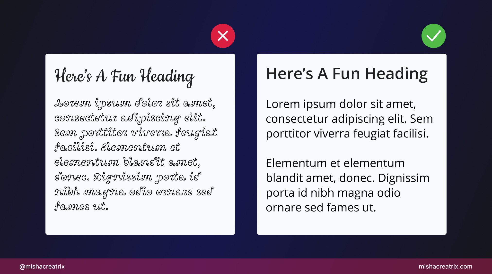
An effective error message describes what happened, why it happened, and what the user can do to resolve the issue.
Most users scan a page to find what they're looking for rather than reading everything. Keep your messages concise and remove unnecessary detail.
When designing an error message ask yourself: does the user need to be interrupted to read this message? If so, consider putting the error in a modal. If not, don't use a modal.
Link To Article: How to Write and Design User-Friendly Error Messages
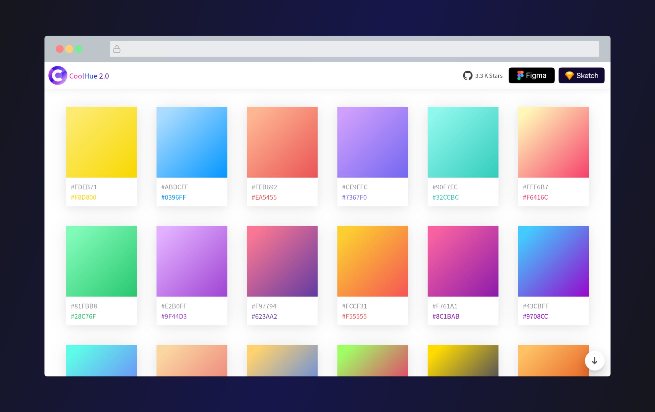
CoolHue 2.0
CoolHue is a resource of hand-picked gradients. Currently, there are 60 to choose from.
The useful thing about CoolHue is that you can do more than simply look at the gradient on the screen.
You can copy the CSS code for the gradient.
You can download an image of the gradient.
You can install it as a plugin on Figma or Sketch or open it in Photoshop.
You can download and run CoolHue for yourself via its GitHub repo.
Screenshot Rocks
Screenshot Rocks is a great tool for capturing mobile + browser screenshots of websites.
A tool like this is useful for creating screenshots of your product to include on your landing page.
I use this tool for capturing screenshots of the sites I review each week in the UI/UX Review section of this newsletter.
Once you enter the URL of a website, you can customize how it looks to produce a beautiful screenshot.
You can download your completed screenshot to PNG, JPG, and SVG for use in your next project.
2 UI/UX Design Tips
Stick with the standard popular fonts from Google fonts
They are widely available, free to use, and they work for a reason.
Once you're a more experienced designer you can venture outside to different fonts if you want.
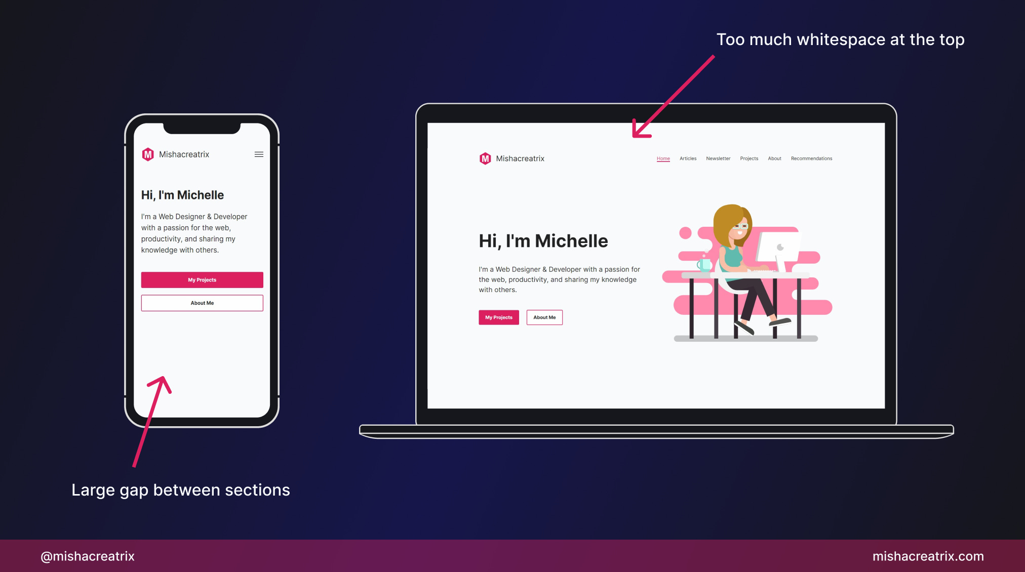
Review your designs at different screen sizes
Look at your website on different screen sizes, at the very least on your computer and on your phone.
This will help you to find design inconsistencies that need to be tweaked between different screen sizes.
1 UI/UX Review
How CoolHue 2.0 Anticipates Its Audience's Needs
This week I'll be talking about CoolHue 2.0, specifically how it caters perfectly to its audience.
The 2 main types of users this tool caters to are:
Designers
Developers
Let's examine the ways in which CoolHue caters to both designers + developers and what we can learn from this.
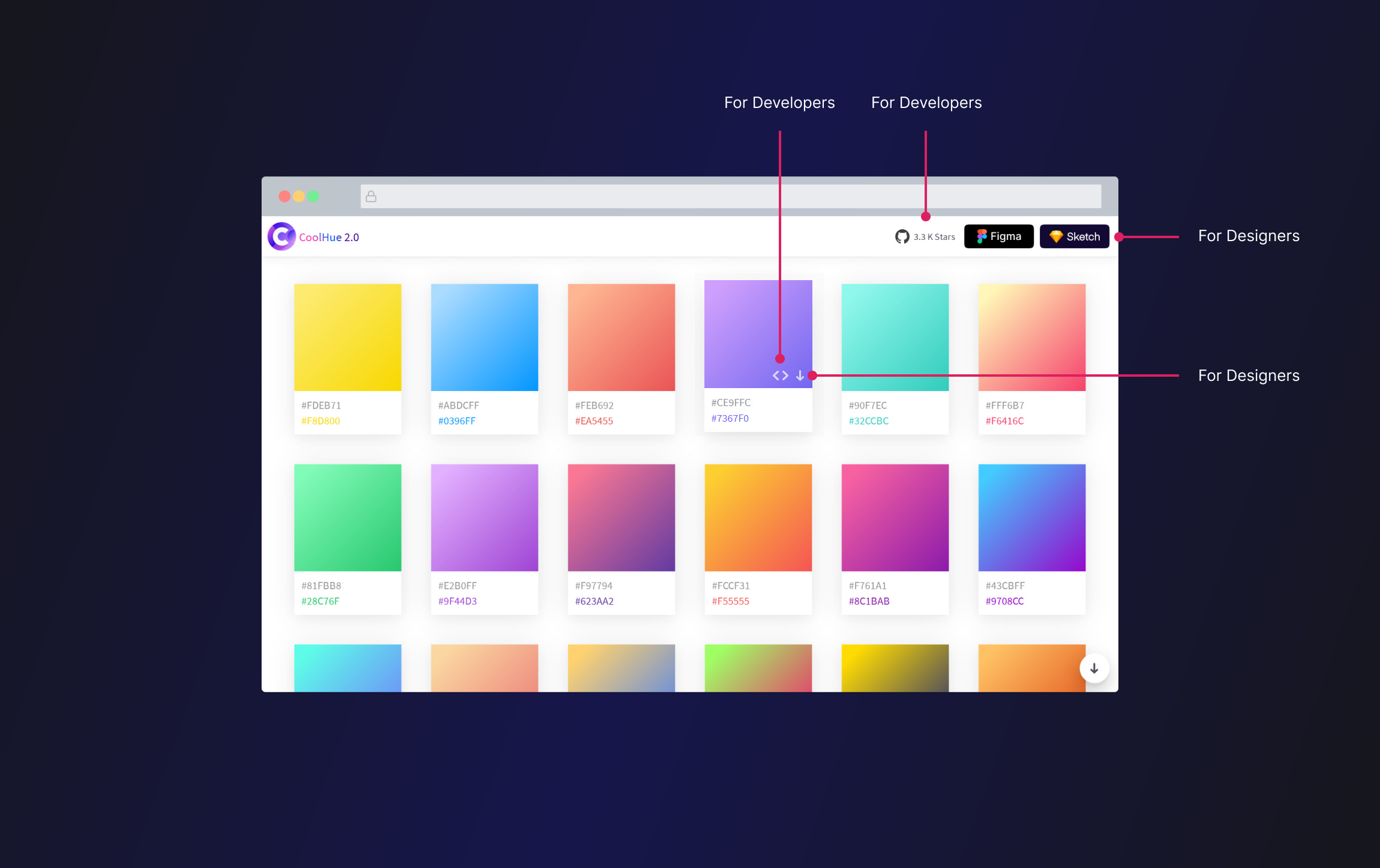
What Is CoolHue 2.0
As mentioned in the Design Library section above, CoolHue 2.0 is a repository of gradients.
It was built by WebKul Design Agency.
1 Designers
For designers, CoolHue 2.0 offers the following:
A visual representation of the gradients as well as the hex colors.
A download option to download a PNG of the gradient.
A Figma plugin and a Sketch plugin to use this gradient palette from inside of your tool of choice.
A Photoshop palette for use in Adobe Photoshop.
2 Developers
For developers, CoolHue 2.0 offers the following:
A visual representation of the gradients as well as the hex colors.
A single-click option to copy the CSS code for the gradient.
A GitHub repo where you can customize gradients and create your own.
3 What We Can Learn From CoolHue 2.0
CoolHue 2.0 does a great job at catering to its audience of designers and developers.
It has built one thing, a repository of gradients, but offers many ways to interact with that one thing.
This increases the potential audience for your product and increases the value of your product.
As this tool was created by a UI/UX design agency, their team likely wanted to build a tool that would be helpful for people like themselves; designers + developers.
It's quite possible they were the target audience when this tool was being designed and built. It may have even stemmed from a problem or an inefficiency the team had when working with gradients.
Creating a product based on a problem you have faced is a great idea:
You are the target audience so you can build what you want.
You can do the testing to ensure things work as they should.
At the end of it, you'll have a product that you can personally use to make your life easier.
If your problem is shared by a wider audience, you can help to solve their problems as well.
With that in mind, this approach also comes with some drawbacks:
Your problem might be specific to you or your team and no one else. This is fine unless your goal is to share your creation with others.
Without external feedback, you could become too attached to your initial design and be reluctant to improve it over time.
Without external feedback, you might miss problems or issues that you've introduced.
TL;DR
Build something once and offer many ways to use it. This increases your potential audience and the value of your product.
If you're not sure what to build, start by building something that solves a problem you face.
CoolHue 2.0 was built by WebKul Design Agency
If you would like to support my creative work you can do so over on Buy Me A Coffee. Let me know if you’d also like a shoutout on the newsletter 🥳
You’ve reached the end of this week’s edition of the Design Insight newsletter. Thank you for reading, I truly hope you found value in the insights I shared today.
Til next week 👋
Michelle