

Design guidelines for complex apps, Twitter card validator, Wappalyzer, using testimonials, clean landing pages, understanding the NotionMetrics landing page
Design guidelines for complex apps, Twitter card validator, Wappalyzer, using testimonials, clean landing pages, understanding the NotionMetrics landing page
Edition 007 Of Design Insight

Hello and welcome back to the newsletter 👋
Let's get started.
3 Design Library Items
Article - 8 Design Guidelines for Complex Applications
Author: Kate Kaplan
Source: NNGroup Blog
Here's what I learned from reading this article:
A complex application has non-straightforward workflows as well as highly skilled users that interact with the application. As well as this, complex apps will cater to a variety of workflows and user types.
Promote learning by doing. Users will rarely read the instructions or manual and simply try something to see if it works. This is the paradox of the active user in action.
Allow for non-linear pathways through an application. Allow the user to go back or leave and come back to their saved point.
Link To Article: 8 Design Guidelines for Complex Applications
Twitter Card Validator
I learned this tool existed only a few days ago and it helped me out immensely so I'm including it here.
If you're a writer on your own blog, you'll want the social media aspect of your content to be working correctly.
Social media is an important way to build an audience and attract them to your blog so things must look good.
The Twitter Card Validator will take a URL, like your new blog post, and show you a visual preview of what it looks like when someone shares that content on Twitter.
That way you can tweak details like the title, description, or image associated with the content to make it stand out and make people want to share it.
Wappalyzer
Wappalyzer is a browser extension that shows you what technologies are used to build websites.
This might not seem useful if you're not into coding. However, it can show you if sites are built using no-code tools like Bubble.io or similar.
I run this every so often on websites I enjoy the design or functionality of to learn what technologies are the most popular.
This gives me a lot of inspiration for building my projects.
2 UI/UX Design Tips
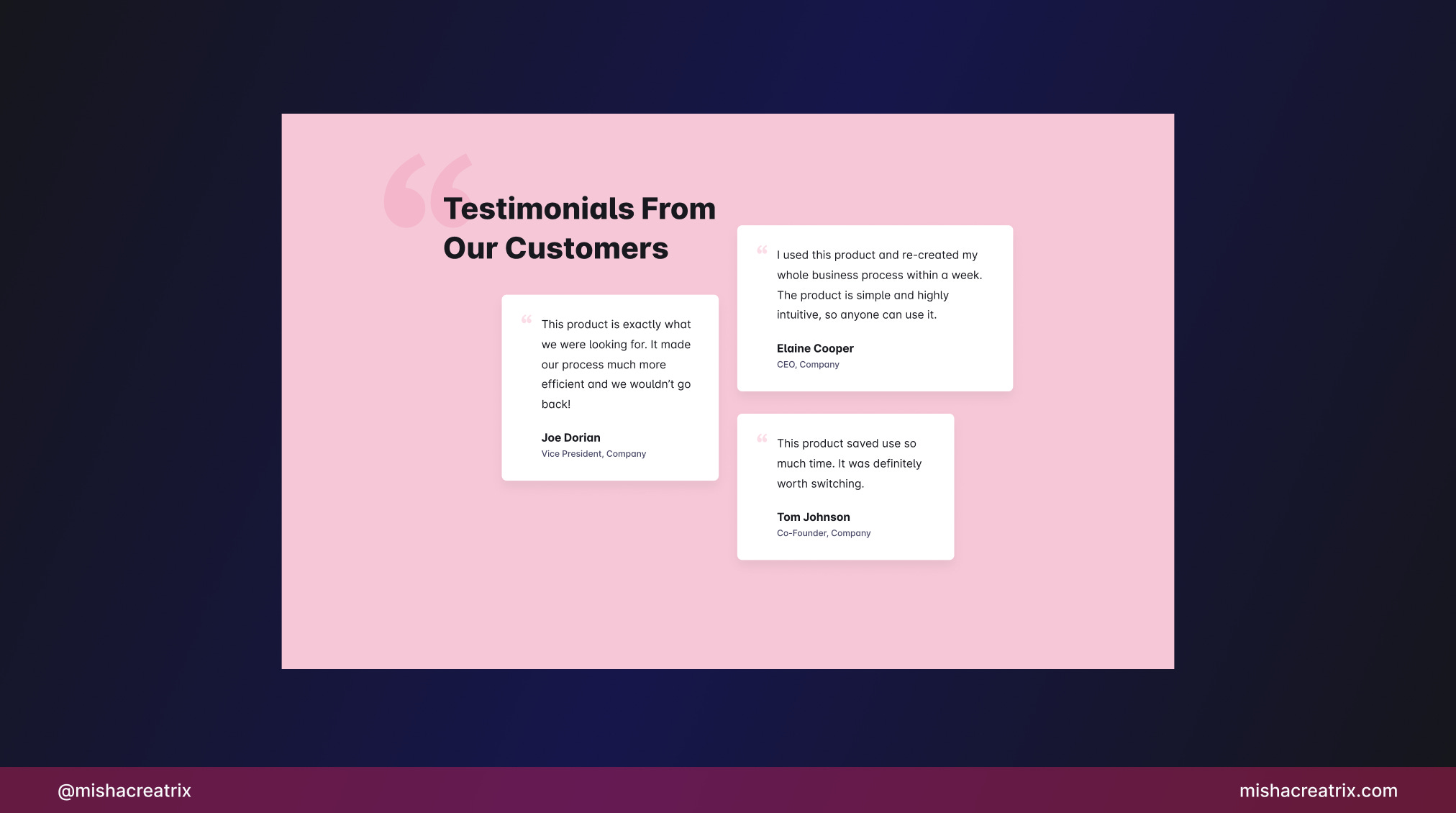
Use testimonials to build credibility
Use testimonials to build credibility.
They offer social proof that your product is helpful.
Remove unnecessary elements from your landing page
Take a look at everything on your landing page.
Is there anything:
Unnecessary Repetitive Unclear
Remove anything that falls under that list.
This ensures a simpler design that can be easily understood.

1 UI/UX Review
Understanding The NotionMetrics Landing Page
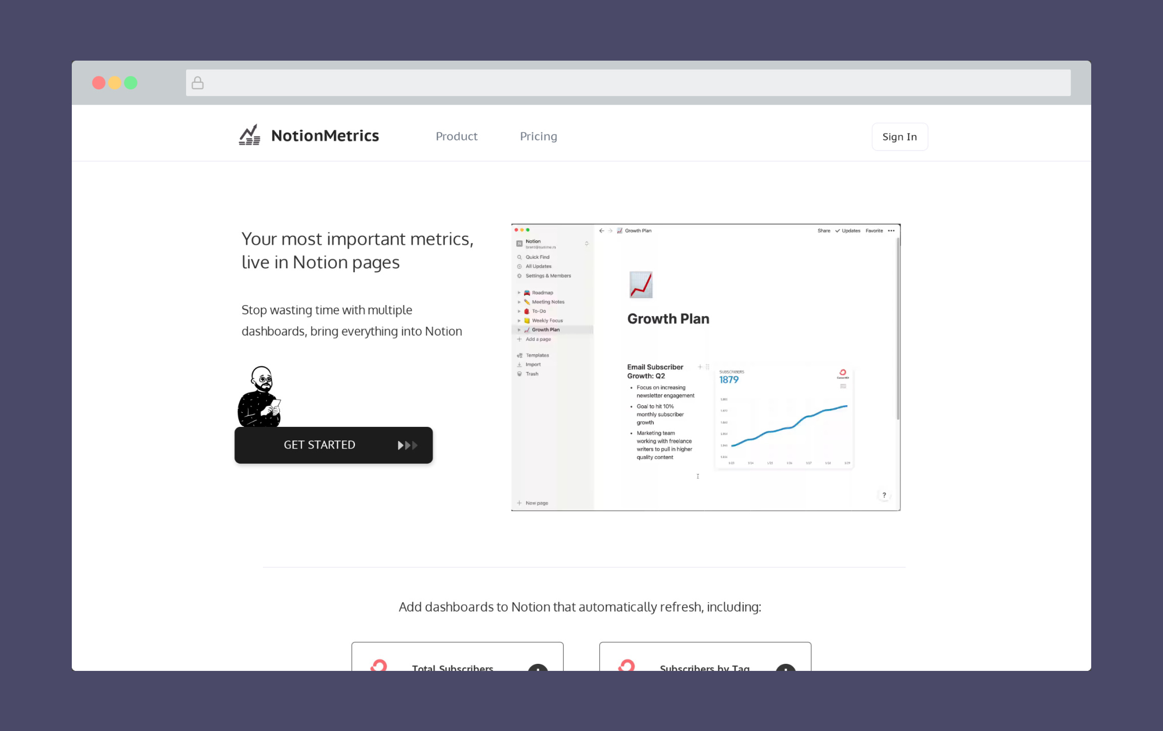
NotionMetrics is a product that turns your various metrics into live dashboards inside of Notion.
You can view your total subscribers on Mailchimp, your daily revenue in Stripe, and your daily productive time in Rescue Time. These are just a few examples.
They offer a free trial where you can test things out. There are 2 paid plans that allow you to create up to 12 metric blocks.
I'm going to look at the NotionMetrics landing page to see how it's designed, what is effective, and what could be tweaked to improve the design and the UX.
1 Logical Ordering Of Content
When I first landed on this page, I read the hero title "Your most important metrics, live in Notion pages", then saw the video clip of the product in action.
I immediately knew what this product was about.
Then as I scrolled down to the next section and clicked one of the options, I was taken off to another screen to start using the product.
That wasn't quite what I was expecting.
As someone who is completely new to the product I'm not sold on the idea of signing up yet, I want to know more before I hand over my bank card.
This is where the ordering of your page content comes in.
The landing page of your product should be designed in such a way as to lead the user on a journey.
A journey from the top to the bottom of the screen and a journey through the story of your product.
Consider what you can showcase on your landing page to encourage and excite users into signing up.
In this case, the Getting Started button in the hero is a common design pattern so that's perfect where it is.
Underneath the hero is a great place to show people how the product works. I'd switch the Connect, Embed, Focus section for the dashboard blocks section with that in mind:

The pricing plan and the bottom CTA to get started are also great where they are.
I think there's also an opportunity here to include testimonials from people that have used the product.
Testimonials are a great way to build trust with your audience and should almost always be used on a product page.
2 Monochromatic Color Scheme
The first thing that immediately struck me when visiting this page is the use of a monochromatic color scheme.
A monochromatic color scheme is where you take a single color as your base, then use various tints and shades of that color.
In this case, the only colors used are black and white with various tints and shades in between. There are some colors in the images and videos but this is quite minimal.
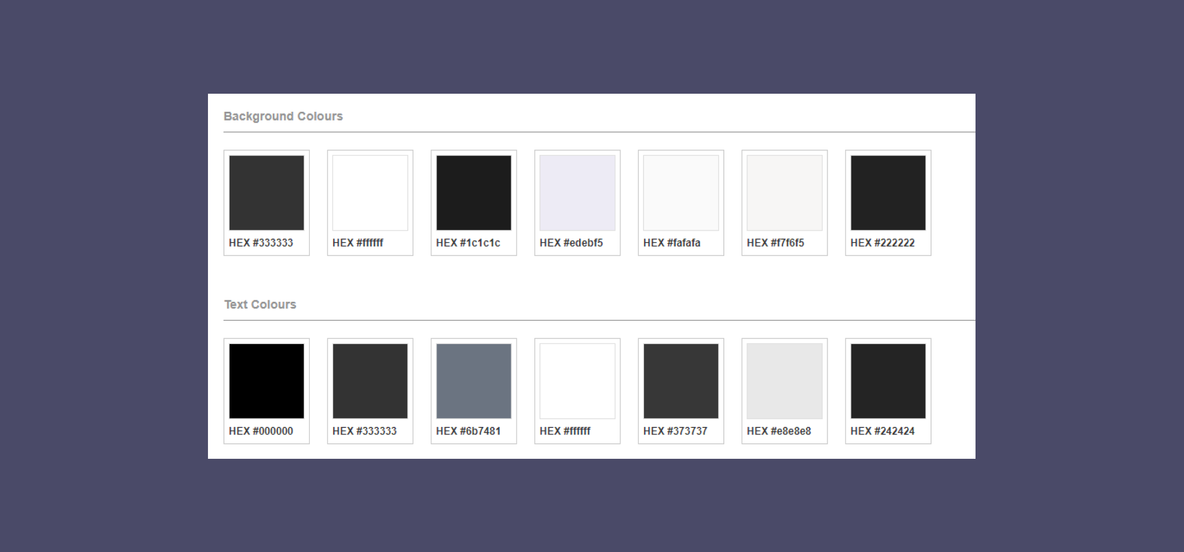
It's likely this was the decision because the Notion logo itself is just black and white. This creates a sense of consistency between the product you are aiming at and your own product.
In my opinion, this use of color is done quite effectively. I'll mention one or two small points in the next section of the review, but I like how clean and simple the choice of color is.
As you can see from the color palette above, there is some further opportunity to simplify the color palette a bit further but I suspect the average person won't notice this.
As an aside here, it might seem difficult to pull off a color scheme like this one.
With that said, it's typically recommended that you start your designs using just black and white.
Color can be a distraction, especially when you are starting to add elements to a design, so it's helpful to take it out of the equation at first.
Once you're happy with the structure of everything, then you can think about adding colors from your color palette.
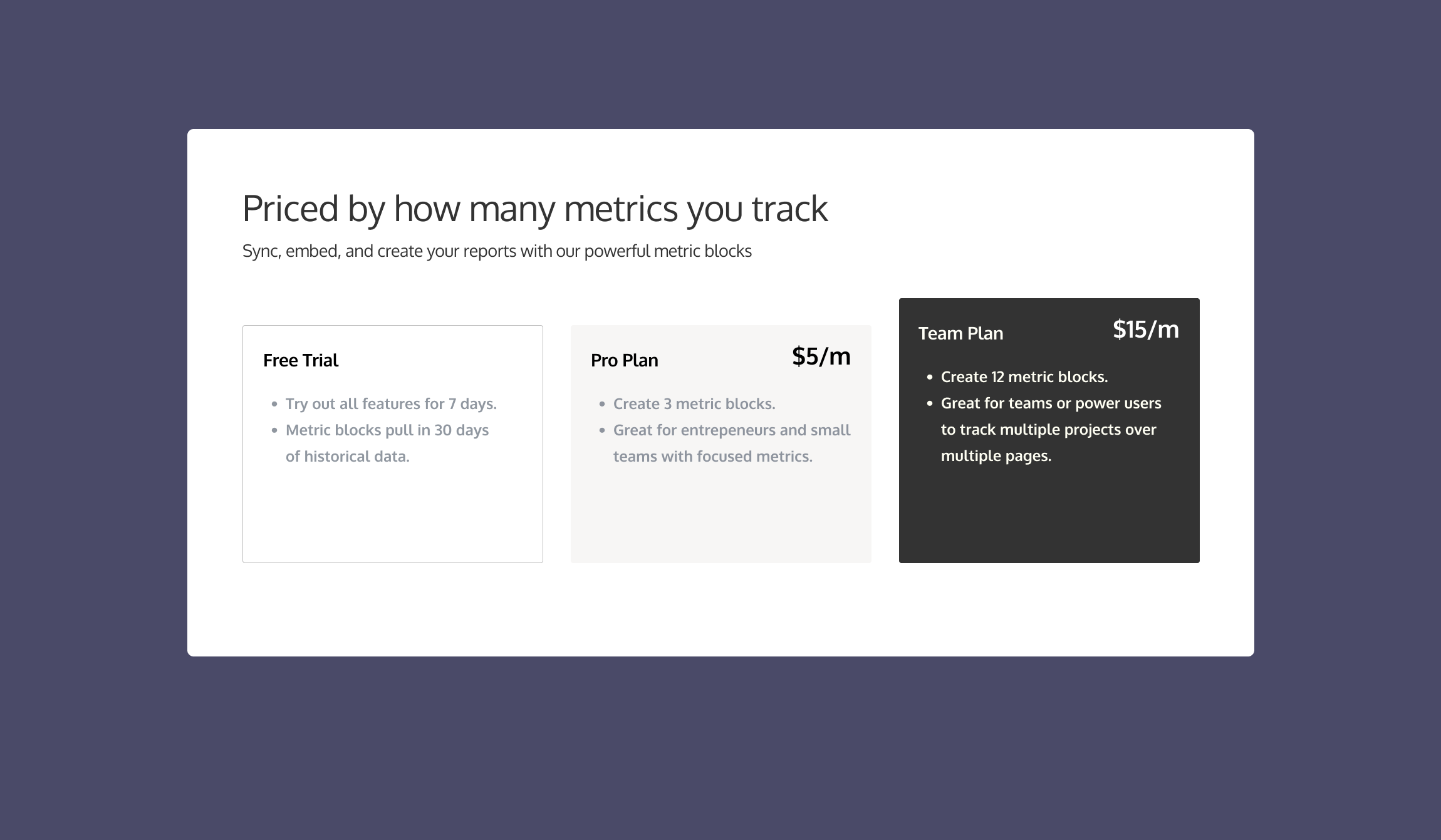
3 Pricing Plans
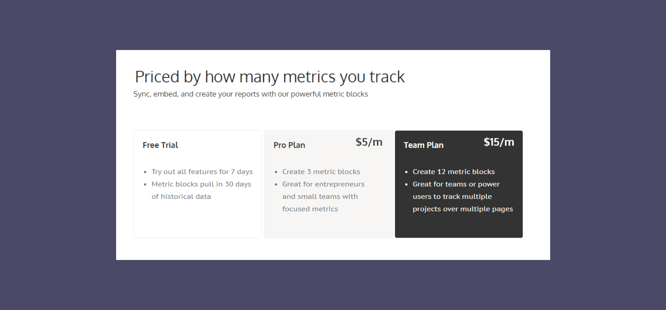
The second to last section of the landing page contains the pricing plans.
By this point, the user should know the who, what, why, and how of your product and be ready to sign up. This makes it the perfect place to include the pricing plan.
NotionMetrics offers 2 plans in addition to a free trial which is a great number of options. Not so many that the user gets overwhelmed.
There are a few ways we can improve the design of the pricing plan section to hopefully increase sales.
The first improvement is to highlight a recommended option. The recommended option might be the best value or it might be the option that most people choose.
To make it stand out, you could:
Change the coloring relative to the other pricing options. This seems to be what's used in the case of Notion Metrics.
Make it taller or bigger in size than the other options.
Label it as the recommended option to make the user's life easier.
See the results here:
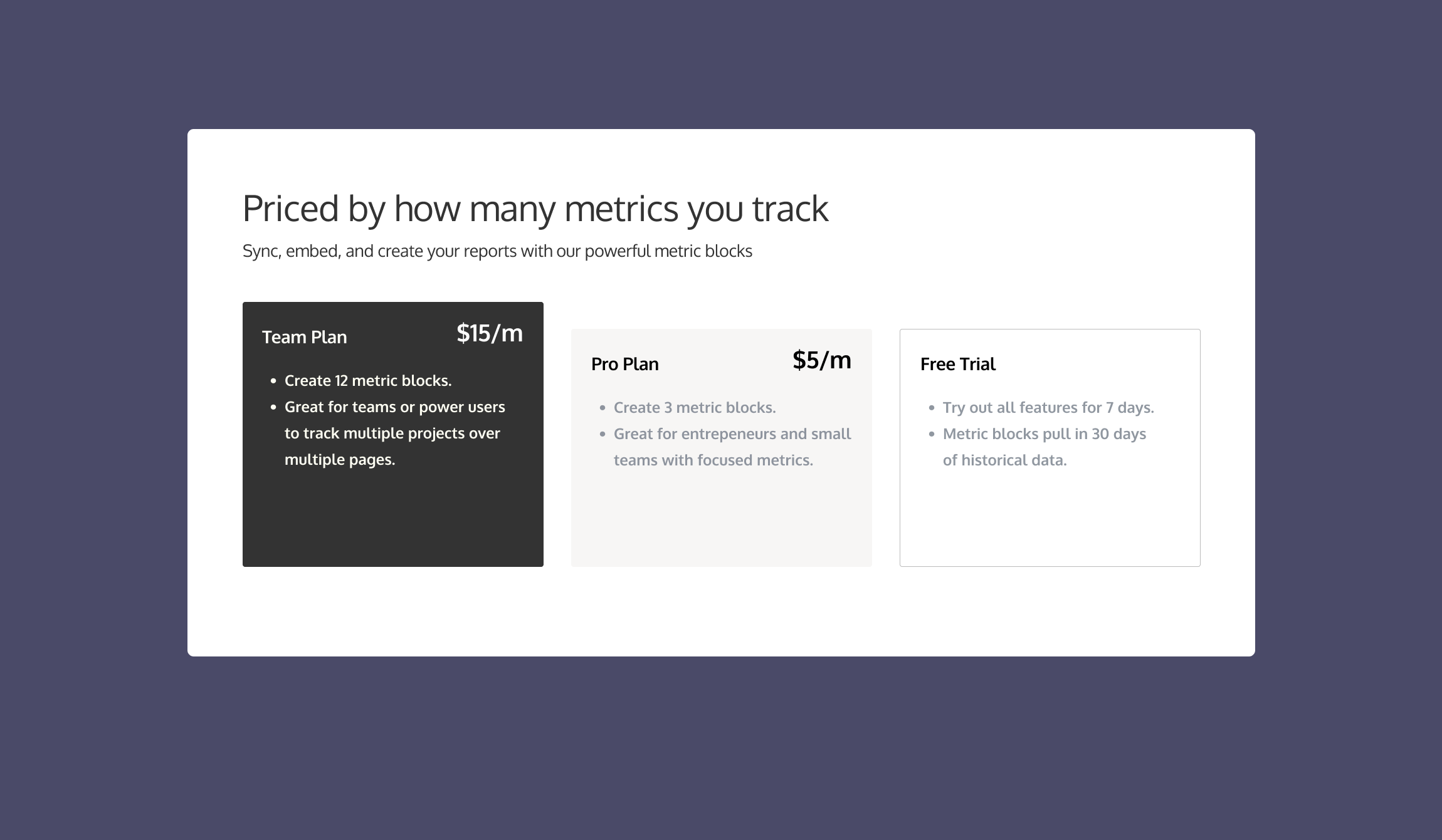
The next improvement is to actually switch the ordering of the pricing plans from most expensive on the left to least expensive on the right.
Believe it or not, something as simple as this can increase the number of people that select the more expensive option.
If you want to read more about designing a pricing page, I recommend you check out this article: A Cheat Sheet to Designing a Pricing Page that Converts. It's not design-related as such but it can certainly impact the design decisions you make.
See the results here:
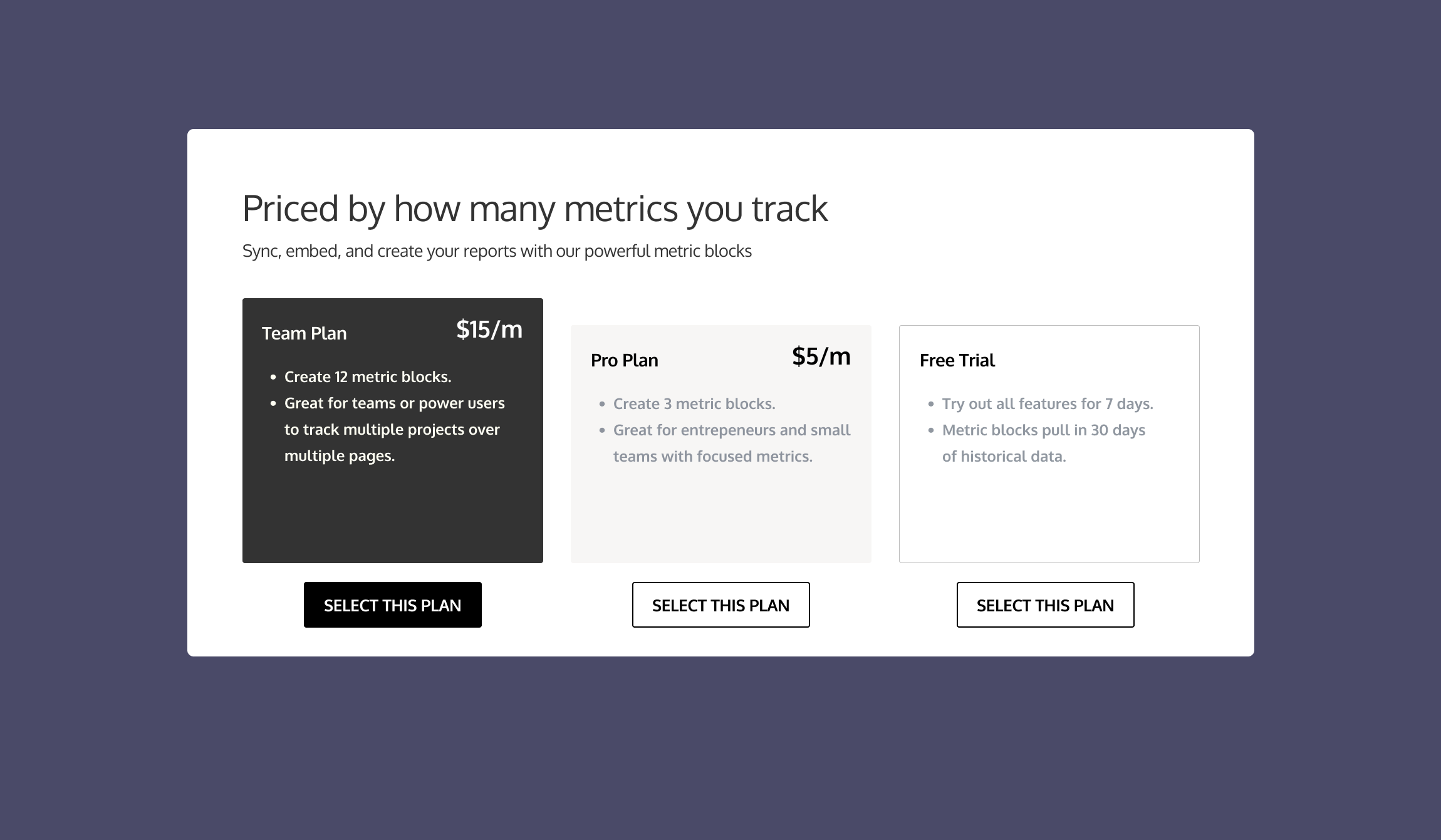
The third improvement is to add CTA (call to action) buttons to each of the pricing plans.
A button with a well-thought-out call to action will encourage the user to sign up and make it easy for them to get started.
See the results here:
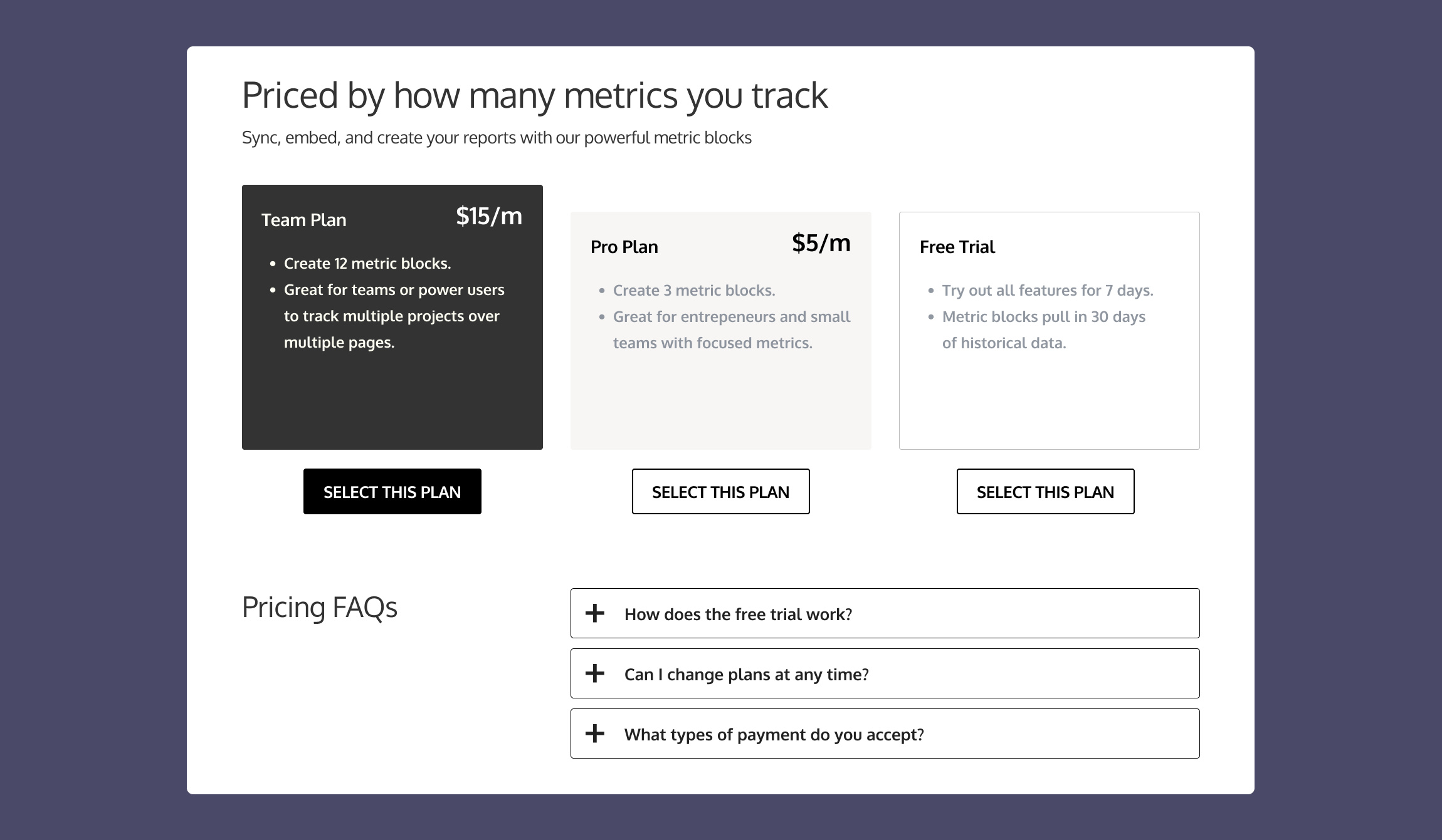
The fourth and final improvement is to include an FAQ section specifically related to pricing questions.
This can be a link underneath the pricing plans that takes you to a separate page or it can be an accordion menu directly underneath.
The point of this is to answer the user's questions before they've asked them.
If you can show you have the answers to commonly asked questions, this increases your credibility and users will be more likely to trust your product.
See the results here:
TL;DR
First impressions matter and your landing page should be a glowing resume for your product.
Think about what to showcase on your landing page to excite users about your product and encourage them to sign up.
Start your designs in black + white and add color when you're happy with the structure + content.
For pricing plans, highlight the recommended option to encourage users to get started.
Include an FAQ section or dedicated page to answer commonly asked questions.
Have a site you want me to review? Send me a DM over on Twitter @mishacreatrix and we can get started.
If you would like to support my creative work you can do so over on Buy Me A Coffee. Let me know if you’d also like a shout out on the newsletter 🥳
You’ve reached the end of this week’s edition of the Design Insight newsletter. Thank you for reading, I truly hope you found value in the insights I shared today.
Til next week 👋
Michelle