Confirmation Bias, Carrd, A List Apart, 2 UI/UX Design Tips, Understanding The Game Thinking Landing Page
Edition 009 Of Design Insight
Hello and welcome back to the newsletter 👋
Since last week’s edition, I’ve created accounts on Medium and Dev.to to share my writing with different audiences. Feel free to check out my work on those sites if you’re interested.
I’m also now a part of the Indie Hackers community so check me out there too!
Let's get started.
🛠 3 Design Library Items
Article - Confirmation Bias
Source: Wikipedia
Here's what I learned from reading this article:
Confirmation bias is where you search for or choose information that supports your existing beliefs or values. By doing this you are also ignoring opposing or contradictory information.
Confirmation bias can be found in many places including on social media and even during job recruitment.
It is possible to overcome the more severe effects of confirmation bias by learning to think more critically and to practice these critical thinking skills.
Link To Article: Confirmation Bias
Carrd
Carrd is a tool for building one-page sites.
You can build a site with no code from scratch or by using pre-made templates.
This tool is helpful for whipping up a landing page for your digital product, your newsletter, or your podcast.
The free plan lets you create up to 3 websites or you can upgrade to a pro plan depending on your requirements.
A List Apart
A List Apart is a great resource for informative articles on design and development.
In particular, there is a focus on web standards and best practices.
This is a great site to add to your bookmarks to check in with each week.
🎨 2 UI/UX Design Tips
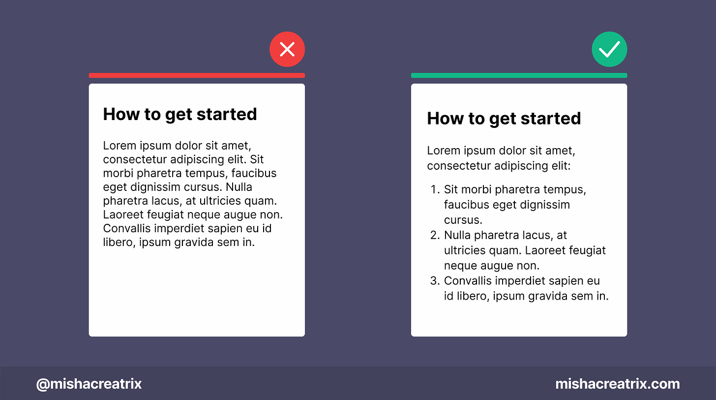
Break up step-by-step processes with numbered lists
Break up step-by-step processes with numbered lists.
This makes them much easier to read and follow along with.
Create an FAQ page for your product
Create an FAQ page for your product.
People will generally have the same questions so point them in the right direction.
🦄 1 UI/UX Review
Understanding The Game Thinking Landing Page
Game Thinking is a website dedicated to promoting the 'Game Thinking' system.
The Game Thinking system takes techniques from video games and adapts them for use in products to create an engaging experience.
To me, it sounds like the concept of Gamification which I've been fascinated by for the last number of years.
I'm sure there's a lot more to it than this but this is what I could glean from the landing page alone.
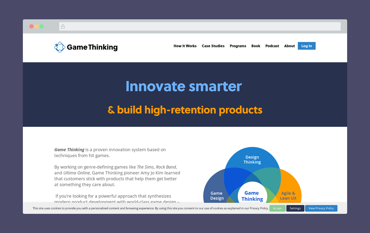
This week, I'm looking at the Game Thinking landing page to see how it's designed, what's effective, and what could be improved.
1 A Powerful Heading That Describes The Value
The heading at the top of the page is an excellent example that showcases the value of the product.
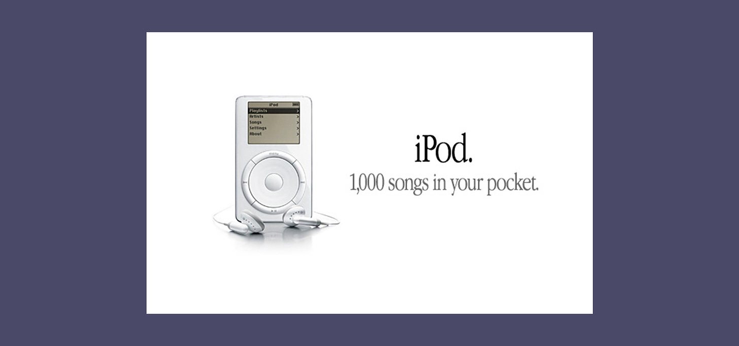
This approach is used quite often if you know to look for it. Companies like Apple did this with their advertisement for the iPod:
The landing page could just say: 'We have a system that is based on techniques from video games which can improve your product', but that wouldn't have been nearly as effective.
While they do mention something to that effect in the body copy, the heading is reserved for something short, sweet, and immediately eye-catching.
'Innovate smarter & build high-retention products'.
If I was someone with a new app or piece of software, the idea of a high-retention product is something that would immediately appeal to me.
People may also be familiar with the phrase 'work smarter not harder'. I believe this draws from that to create something recognizable.
The only thing that slightly niggles at me about this section is the coloring of the headings.
It might be a personal preference here, but I prefer the text in white. This creates more of a contrast against the background and makes the heading stand out.
Let me know what you think:
2 Use of Brand Logos To Build Credibility
An effective way of building credibility is to include the logos of companies you've worked with.
This is something we can see on the Game Thinking landing page. Companies like Netflix, Google, and Ubisoft feature prominently on screen.
This encourages the audience to think ''Wow! they've worked with Google and Netflix, they must know what they're talking about!''.
Another way to add social proof here would be to include testimonials from people at these companies.
This would give the audience more of an insight into what the Game Thinking process involves. It would also offer a third-party objective perspective which would further build credibility.
If you'd like to learn more about the idea of social proof, here's a great article I came across during my research:
How to Use Social Proof in Your Marketing
3 A Visual Overview Of The Program
The visual at the bottom of the screen does a great job of describing the process involved with the Game Thinking model.
It shows you each phase in an easy-to-understand linear way from left to right.
Just by looking at this diagram, I have a much clearer understanding of Game Thinking and what it involves. So much so that I wonder if this graphic would have more impact higher up the page underneath the heading 🤔
After the attention-grabbing headline, this graphic would do a great job of showing the audience what's involved.
One way the graphic itself could be improved is if the colors matched the other colors on screen.
In the Venn diagram image above, there are shades of blues and oranges used that would be great to see in this diagram also.
It would create a more cohesive design and look like it belongs on this website.
TL;DR
An effective headline showcases the value your getting rather than just what the product does.
Include the logos of companies you have worked with to build credibility.
Include testimonials to build social proof.
Include visuals to show your audience how your product/service works.
For a cohesive design, create graphics that match your color scheme/branding.
If you have something helpful you'd like included in the newsletter, DM me over on Twitter.
If you would like to support my creative work you can do so over on Buy Me A Coffee. Let me know if you’d also like a shout out on the newsletter 🥳
You’ve reached the end of this week’s edition of the Design Insight newsletter. Thank you for reading, I truly hope you found value in the insights I shared today.
Til next week 👋
Michelle


