

Centered and full-justified text, Usability.gov, GetTerms, 2 UI/UX Tips, Understanding The Notion PM Landing Page
Centered and full-justified text, Usability.gov, GetTerms, 2 UI/UX Tips, Understanding The Notion PM Landing Page
Edition 010 Of Design Insight

Hello and welcome back to the newsletter 👋
Welcome to edition 10 🥳
Let's get started.
3 Design Library Items
Article - Centered and full-justified text on the internet
Author: Jon Schroeder
Source: Elodin Design
Here's what I learned from reading this article:
Never full-justify text online - it results in weird spacing and doesn't look great.
Center text sparingly
It's harder to read centered text
Doesn't allow for quick scan-ability
Left-align on mobile
Center text examples
When showing off a grid of items and you have a bit of text above it.
Link To Article: Centered and full-justified text on the internet
Usability.gov
Usability.gov is an excellent resource for people looking to learn about usability.
It's a great place to get started with the theory of Usability you can then apply to your designs.
I highly recommend bookmarking this site and reviewing one or two articles each week to build your knowledge.
GetTerms
GetTerms is a free tool to generate privacy policy copy for your website.
In a world of privacy and website requirements, it can be difficult to know how to set up your privacy policy effectively.
Enter your details and generate a generic privacy policy statement to add to your website. Be sure to proofread and update as necessary.
2 UI/UX Design Tips
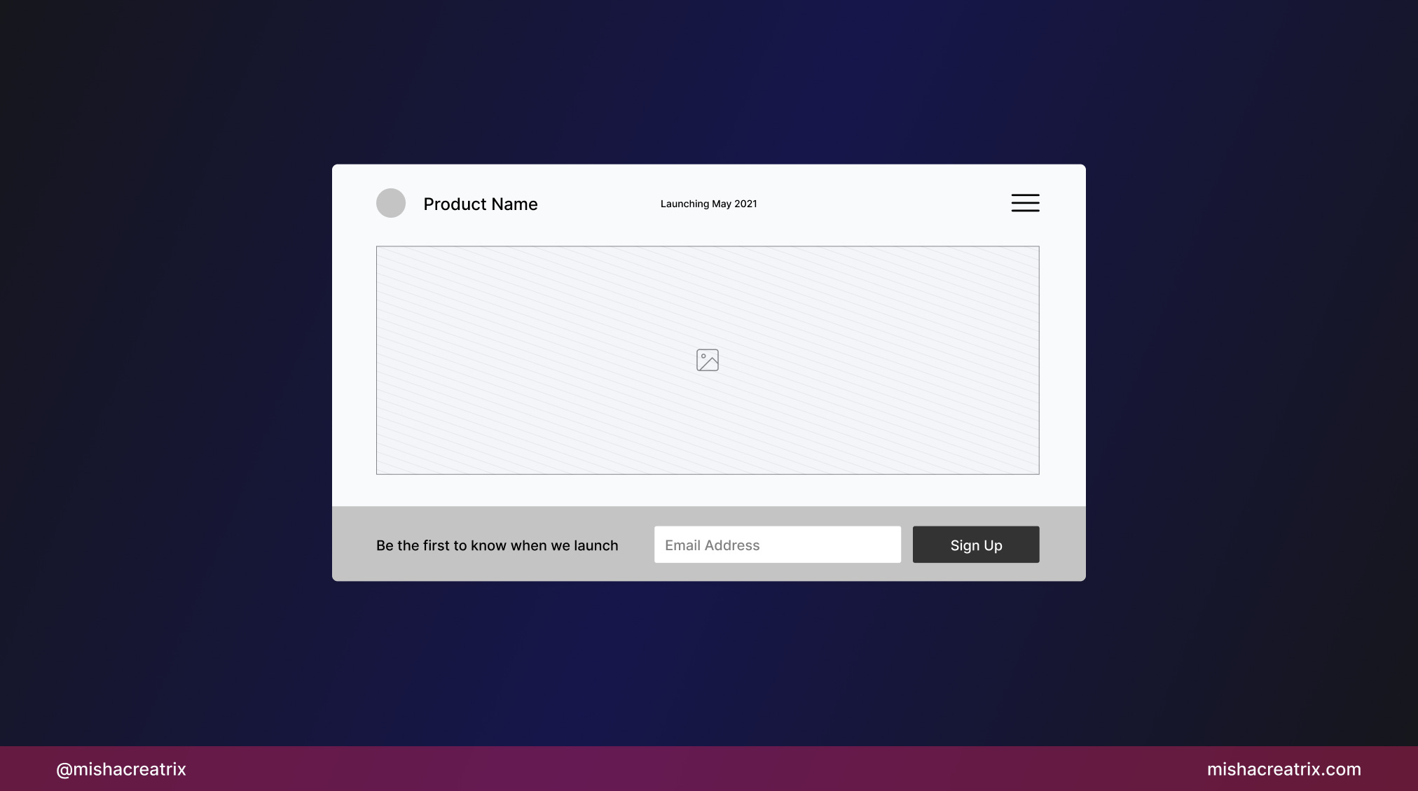
Design empty states
Design the empty states of your website or app.
These screens initially have no data but can be later populated by the user.
Use empty states to guide your user:
Tell the user to do something
Show the user how things work
Use starter content
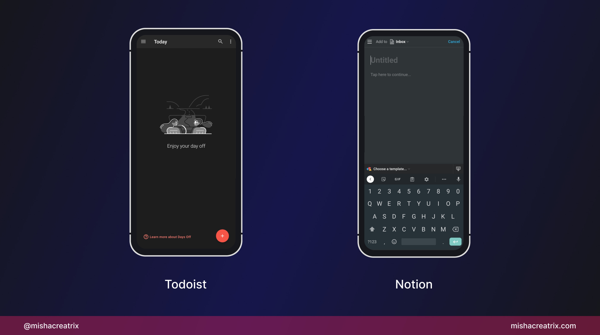
Display your product's status
If your product isn't live yet, let the user know.
It gives them a clear understanding of what to expect.
If your product is in beta testing, invite people to test it out.
1 UI/UX Review
Understanding The Notion PM Landing Page
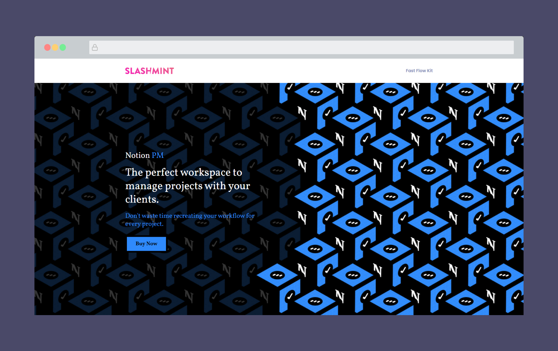
Notion PM is a Notion dashboard for freelancers looking to organize their work.
It offers many pre-built pages and can be customized to suit your needs.
As a big fan of Notion, this landing page immediately caught my attention and quickly became a candidate for a review.
This week, I'm looking at the Notion PM landing page to see how it's designed, what's effective, and what could be improved.
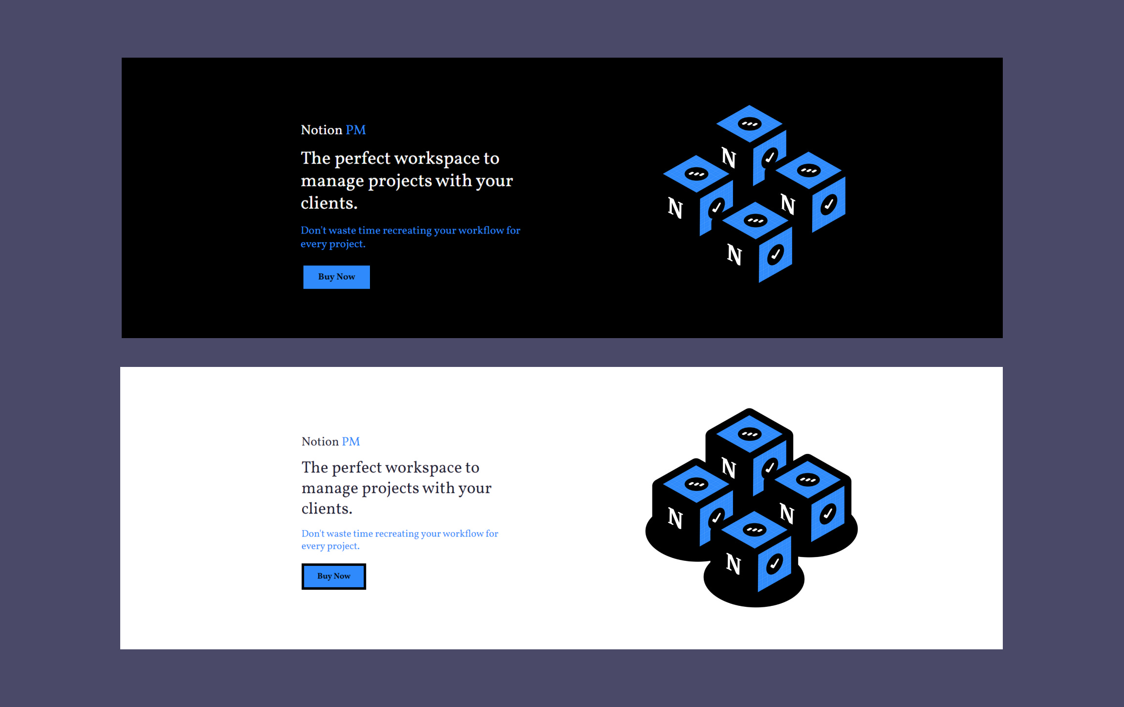
1 Use Of Color + Pattern
The use of color on this landing page is simple and effective.
It's mainly blue, black, and white. Blue is used as the accent color for some backgrounds, headings, and call-to-action buttons.
With that said, it was the use of pattern that caught my attention when I first looked at this page.
A pattern is created by repeating the product logo many times on the page.
It creates an interesting visual effect but it can have the tendency to overshadow the content which shouldn't be the case.
The hero is the main place this graphic pattern is used.
As there is not enough contrast (visual difference) between the background pattern and the text, it can be difficult to read. The text doesn't really stand out as being important.
My eye is immediately drawn to the pattern and nothing else is in focus.
One way to tweak the design would be to reduce the pattern and limit it to 4 - 8 instances of the icon on the right of the screen.
This would make the hero less busy and the reader can focus on reading the text to understand what the product is about.
You could also swap the background color from black to white for a brighter visual aesthetic.
2 Use Of Engaging Copy
As I scrolled through this landing page I was impressed with the copy.
There are some great insights to be gained from examining Notion PMs landing page copy so let's take a look.
In the hero section, we have a headline and sub-headline which are effective at informing the user and invoking emotion.
'The perfect workspace to manage projects with your clients'
This headline perfectly summarizes what the product does in one short sentence.
'Don't waste time recreating your workflow for every project.'
The sub-headline taps into the user's mindset, in particular the frustration of having to start from scratch with each new client.
The goal is for the user to read this and think 'god I hate that problem, I would happily pay to have it solved'.
The next section further down the page continues to engage with the user effectively.
The creator explains the pain they experienced and why they created this product i.e. to solve that pain.
It offers some insight into why the product was made which adds to the product's credibility.
The rest of the landing page has some great examples of copy that are worth checking out including the benefits of the product and the FAQ section.
3 Building Credibility
The third point I want to focus on is how this landing page is designed to build credibility.
Credibility is important to consider when designing a landing page that offers a product or service.
It's essentially another word for trust. The user/customer should trust your product before they buy it.
Let's look at how Notion PM does this effectively.
Let's take a look:
Testimonials
FAQs
Product Hunt Badge
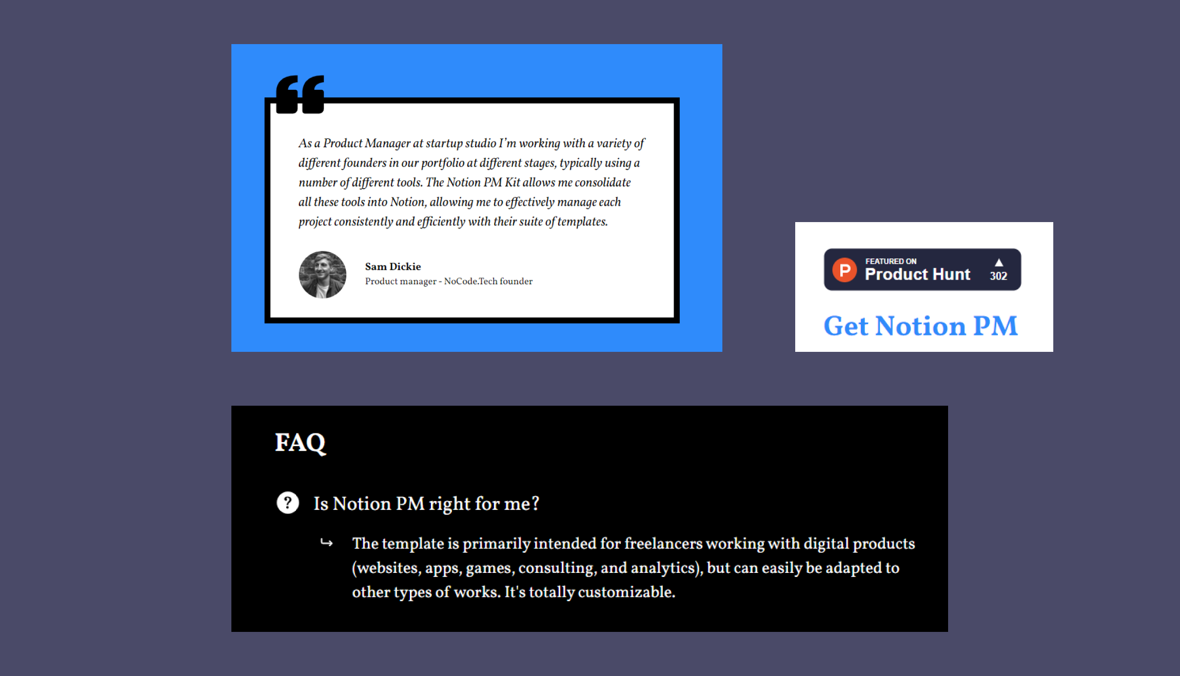
We've talked about testimonials before in this newsletter and this week will be no different.
Notion PM offers a glowing testimonial from a happy customer which includes a photo of the person and a description of who they are 👍
As you can probably guess, the best way to improve credibility here is to include more testimonials.
FAQs are also something we looked at in previous reviews.
This should show you how important they are to have on your website in some shape or form (if you offer a product or service).
The list of FAQs on this landing page does a great job of informing the reader and they are laid out in an easy-to-read way.
It's important to note here that your FAQs should evolve over time.
As you sell your product to more and more people, the type of questions you get asked most commonly will become obvious.
You should tweak your FAQs to include these questions (including how they are worded by your audience) and add informative answers.
A Product Hunt badge is something I have noticed a lot more since I started doing these reviews.
In the case of Notion PM, it adds credibility to the product by showing how many people have upvoted it on Product Hunt.
You can read more about this feature here: Add a Product Hunt upvote badge to your website
TL;DR
Avoid busy patterns as they overwhelm the design and distract the user.
Your copy should show the user's frustration and explain how your product solves it.
Build your product's credibility by using testimonials, Product Hunt badges, and great FAQs.
Add credibility to your product by including a Product Hunt badge
If you have something helpful you'd like included in the newsletter, DM me over on Twitter.
If you would like to support my creative work, you can do so over on Buy Me A Coffee. Let me know if you’d also like a shout out on the newsletter 🥳
You’ve reached the end of this week’s edition of the Design Insight newsletter. Thank you for reading, I truly hope you found value in the insights I shared today.
Til next week 👋
Michelle