

6 Principles to make your ideas stick, Canva, Gradientify SVG Icons, better hero design, how Screenshot.Rocks works
6 Principles to make your ideas stick, Canva, Gradientify SVG Icons, better hero design, how Screenshot.Rocks works
Edition 006 of Design Insight

Hello and welcome back to the newsletter 👋
We're on newsletter number 6 already! I hope you’re enjoying the content.
Let's dive in.
3 Design Library Items
Article - The 6 Principles to Make Your Ideas Stick
Author: James Le Source: Medium
Here's what I learned from reading this article:
Get into the habit of stripping your ideas into their most essential elements. They will be easier to understand. This is like the concept of First Principles thinking.
Ideas that are unexpected and challenge our mental models hold our attention and we're more likely to remember them.
Learning to tell good stories is a great way to foster imagination in your audience. It allows them to become inspired.
Link To Article: The 6 Principles to Make Your Ideas Stick
Canva
Canva is a design tool for creating social media graphics, presentations, book covers, resumes. Almost anything you can think of.
It has a free version which is great when starting out. In fact, I still use the free version.
Imagery is a great way to add more life to your content. Having an accessible tool for creating logos, hero images, or social media graphics is so helpful.
Gradientify SVG Icons
I'm always on the lookout for new and interesting icon sets and today's choice is no exception.
Gradientify SVG Icons are a free set of customizable icons that can add a splash of color to your designs.
You can change the color of the gradient completely or select from one of the predefined sets of gradients to create a unique set of icons.
As they are an SVG format, these icons should scale very well no matter what size they are on screen.
2 UI/UX Design Tips
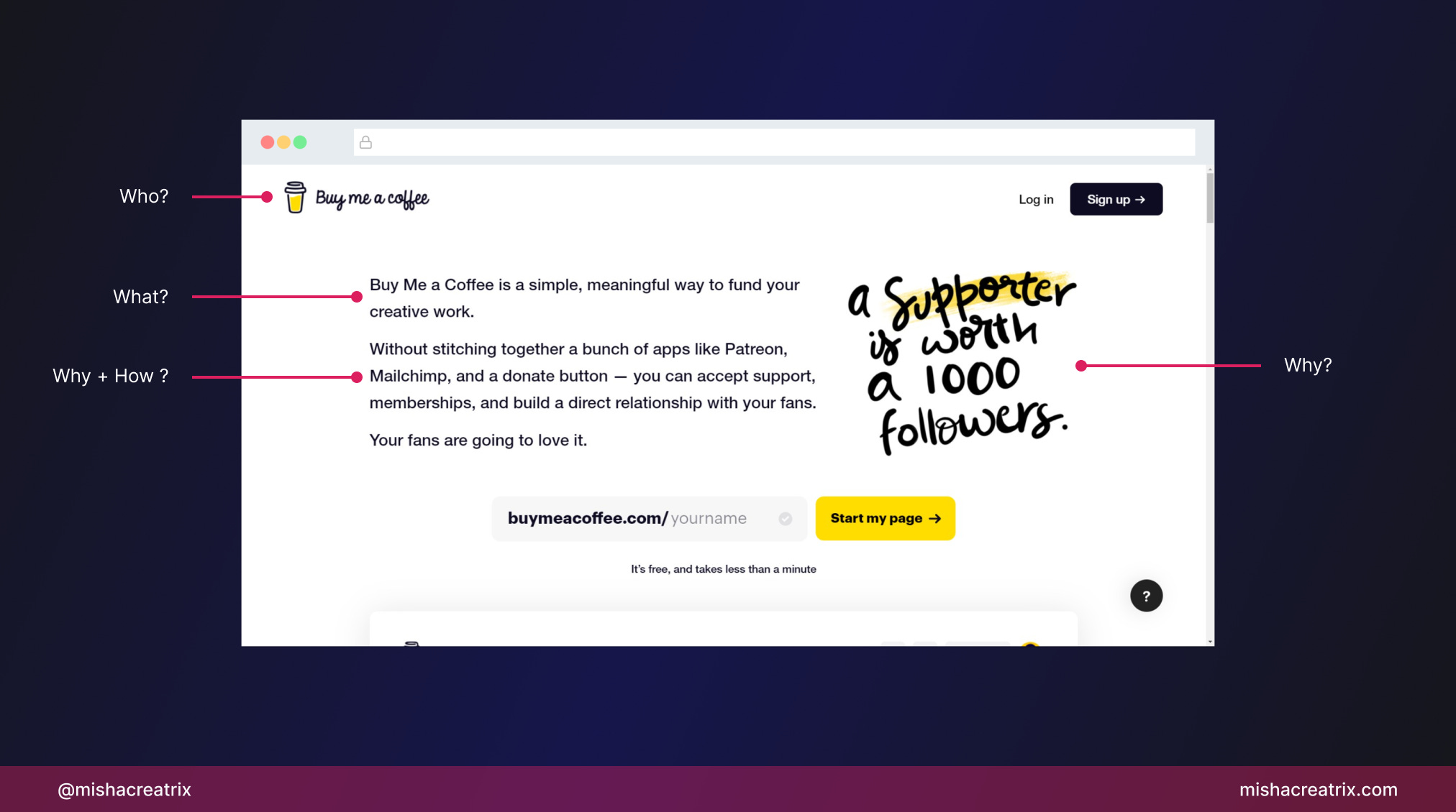
A hero should explain who, what, why, and how
An effective hero section answers the following questions:
Who, what, why, how.
Who you are
What's your product
Why you do it
How you do it
Do this in a clear, simple way and you'll have an informed audience.
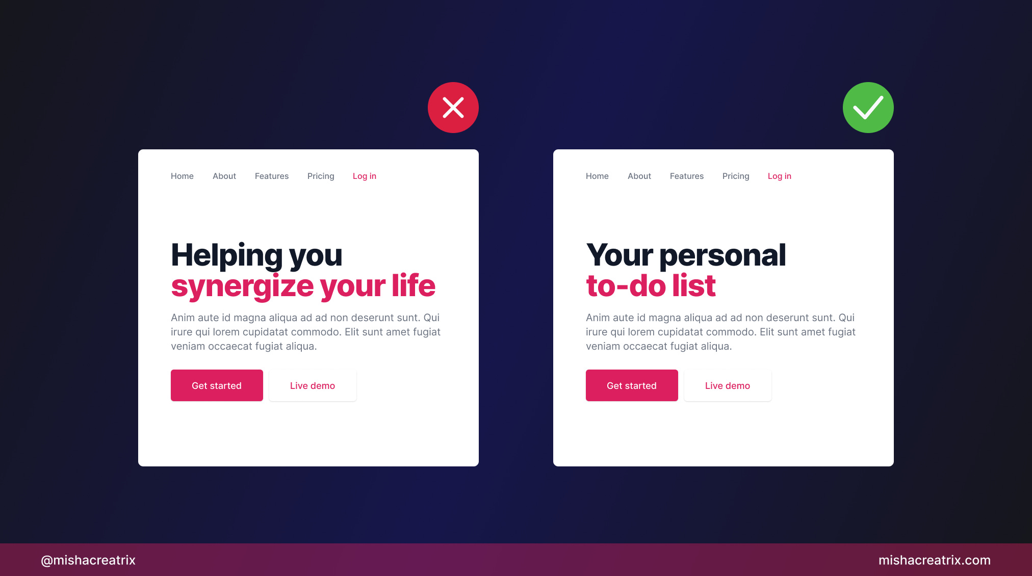
Say what your product does immediately
Clearly say what your product does immediately.
A reader takes about a second to scan the hero section of your landing page to find out what your product is and how it can help them.
Don't clearly state this and the reader will try somewhere else.
1 UI/UX Review
How Screenshot.Rocks Works

Screenshot.rocks is a free open-source web tool for creating screenshots.
Enter a website URL or upload an image, customize it, and you have a beautiful web or mobile sized-screenshot.
I mentioned Screenshot.rocks in last week's Design Library section. This week I want to focus on the UI and UX aspects of this tool; including what it does well and where it could be improved.
1 Easy To Get Started
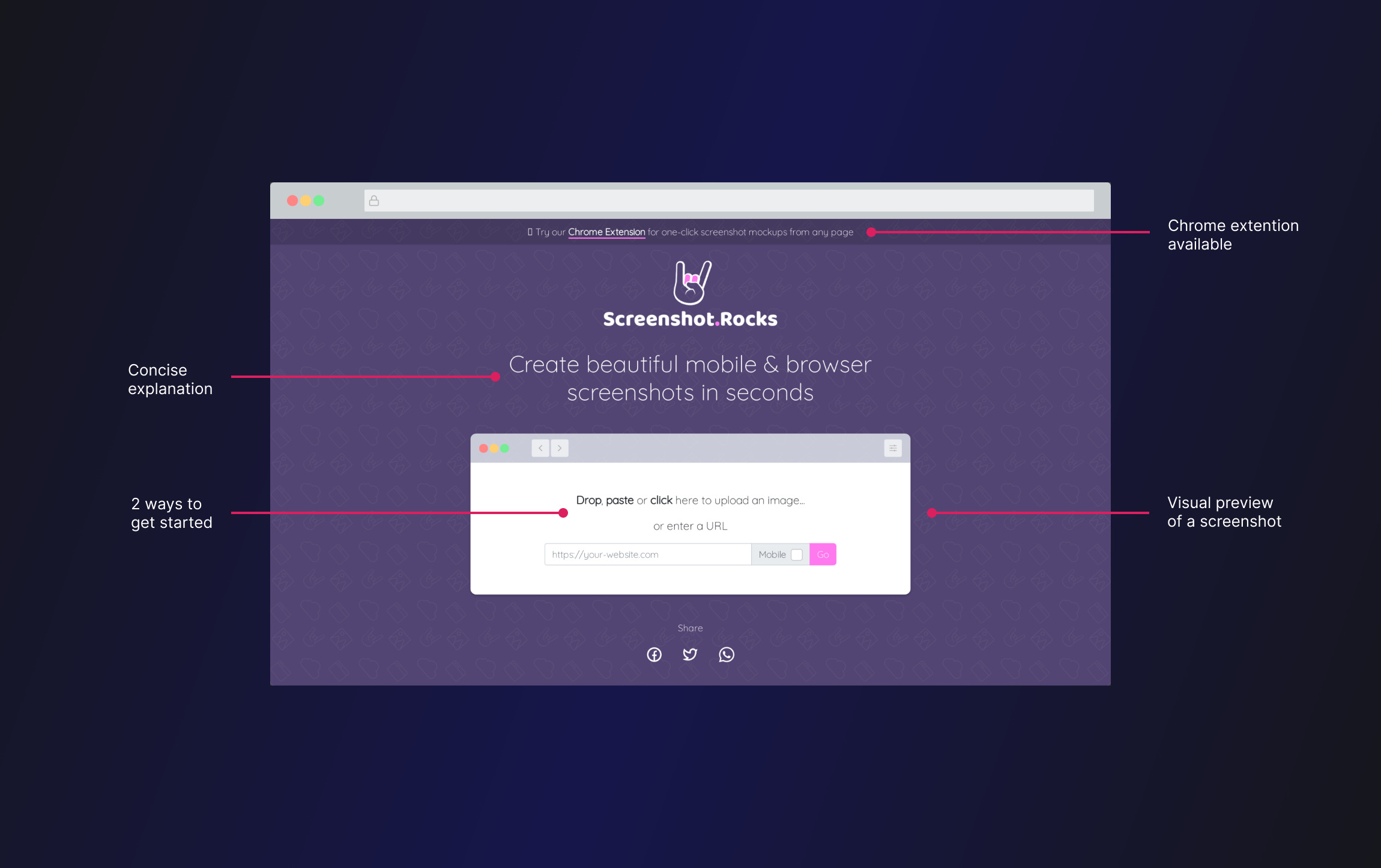
The first sentence on the landing page is clear and concise. I know exactly what this tool is.
The screenshot interface under the intro sentence is where you can start using the tool. Just upload a photo or enter a website URL.
As this is all at the top of the page, it's the first thing you see. You're encouraged to start using it right away.
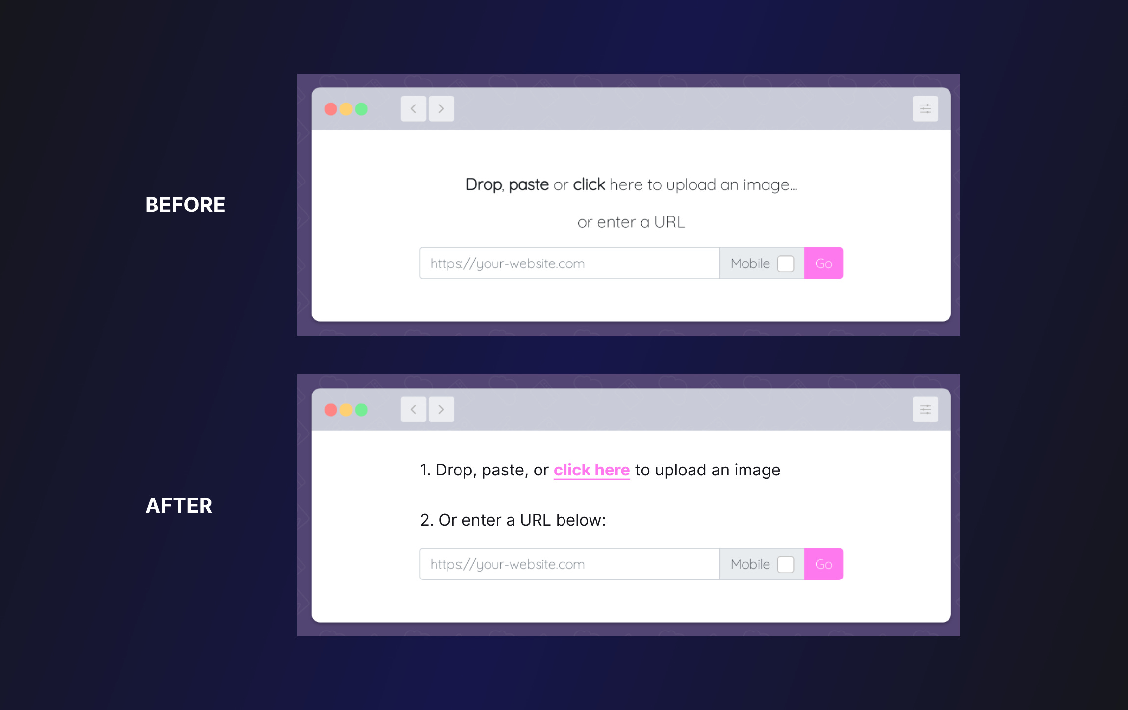
It took me a while to notice the 2 different options for upload and URL.
The font-weight is a bit confusing. My eyes are drawn to Drop, paste, click which all relate to the upload image part. Nothing is drawing my attention to the URL sentence.
A potential improvement here would be to align the text to the left and add numbering. This would make the options easier to scan.
2 Toolbar - Customization Options
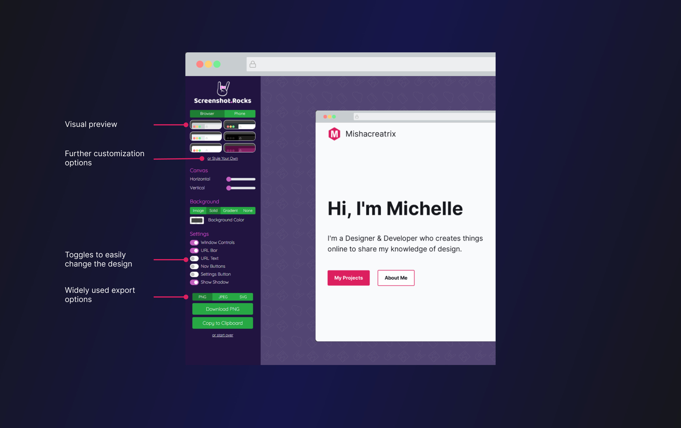
A toolbar is usually made up of several components you can interact with to perform an action. On Google sheets, for example, there is a toolbar for formatting text.
The toolbar is a section that could cause problems for the user. If a user has too many choices, they become paralyzed and don't know where to start.
In the case of Screenshot.rocks, multiple steps have been taken to ensure that doesn't happen.
Grouping - similar options have been visually grouped together to break the content into bite-sized chunks.
Visuals - some options give you a visual preview of what you'll get when you press them.
Interactive components - the use of toggle switches and sliders encourage the user to interact with these components to see what they do.
Limited options per section - Each group of components has a limited number of options to limit visual overload for the user.
This section could be further simplified by removing some options. I would limit the number of options and allow expert users to access more if they want to.
This will allow new users to get started easily but also allow expert users to complete their task.
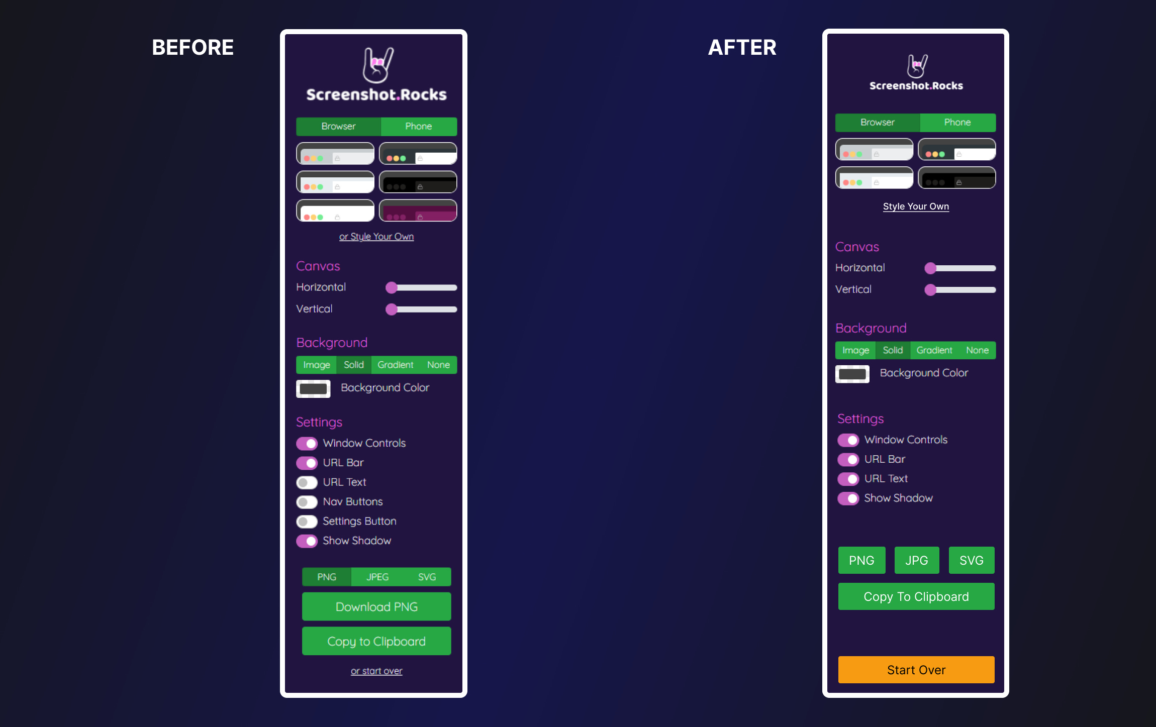
3 Start Over Option
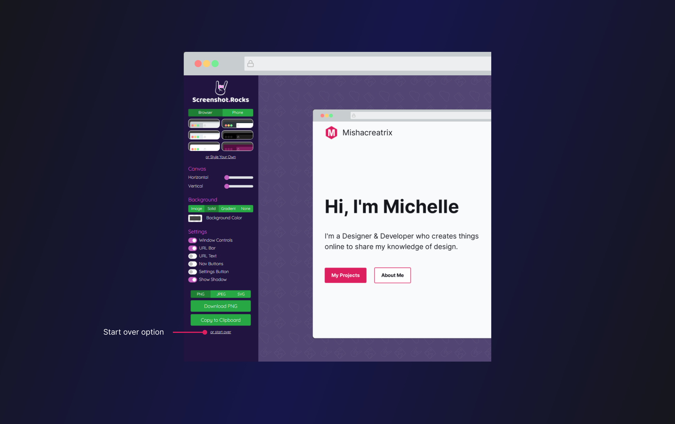
The start over option at the bottom of the toolbar relates to the usability heuristic: User Control + Freedom.
What this heuristic means:
Users should be allowed to make mistakes and change their minds. Provide users with an emergency exit option.
In a tool like this with lots of configuration options, it can be helpful to give the user a way to start from scratch.
In this case, I might want to work on multiple screenshots, so I need a way to go through the process multiple times.
I would probably give this option a little more visual prominence to ensure it's easily found. This could be done by visually separating it from the rest of the toolbar and turning it into a button component. A different color would also make it stand out as important.
(See screenshot in the section above).
TL;DR
Tips for improving your web app's user experience:
Make it easy to start using your product.
Limit customization options to avoid information overload.
Over time you can provide more options for experienced users. This shouldn't complicate things for new users.
Have a way to start over or go back to the home screen.
If you have something helpful you'd like included in the newsletter, DM me over on Twitter.
If you would like to support my creative work you can do so over on Buy Me A Coffee. Let me know if you’d also like a shout out on the newsletter 🥳
You’ve reached the end of this week’s edition of the Design Insight newsletter. Thank you for reading, I truly hope you found value in the insights I shared today.
Til next week 👋
Michelle
These are so good Michelle and getting better each week!!