
🔎 Pay Attention To The Smallest Details
Use of color in a show like Better Call Saul is everything

Hi there 👋 I'm Michelle and this is Edition 087 of Design Insight. A weekly newsletter for creatives with a focus on design.
Let's get started.
Spoiler Warning: I will be talking about the TV Show Better Call Saul. I won't be discussing any plotlines but I will be including some shots from the show so depending on how spoiler averse you are here is your warning.
The use of color in Better Call Saul is a really important part of the show.
Whether it be the color of the scenery, the costumes, or the color thrown from various light sources, everything is deliberately chosen to give a specific meaning.
Context
I recently finished watching Better Call Saul (BCS) and found the show very enjoyable.
As a Breaking Bad fan, I was curious to see the origin stories of many of the show's popular characters including Saul Goodman.
I remember the use of color being pretty significant in Breaking Bad and the same is also true of this show.
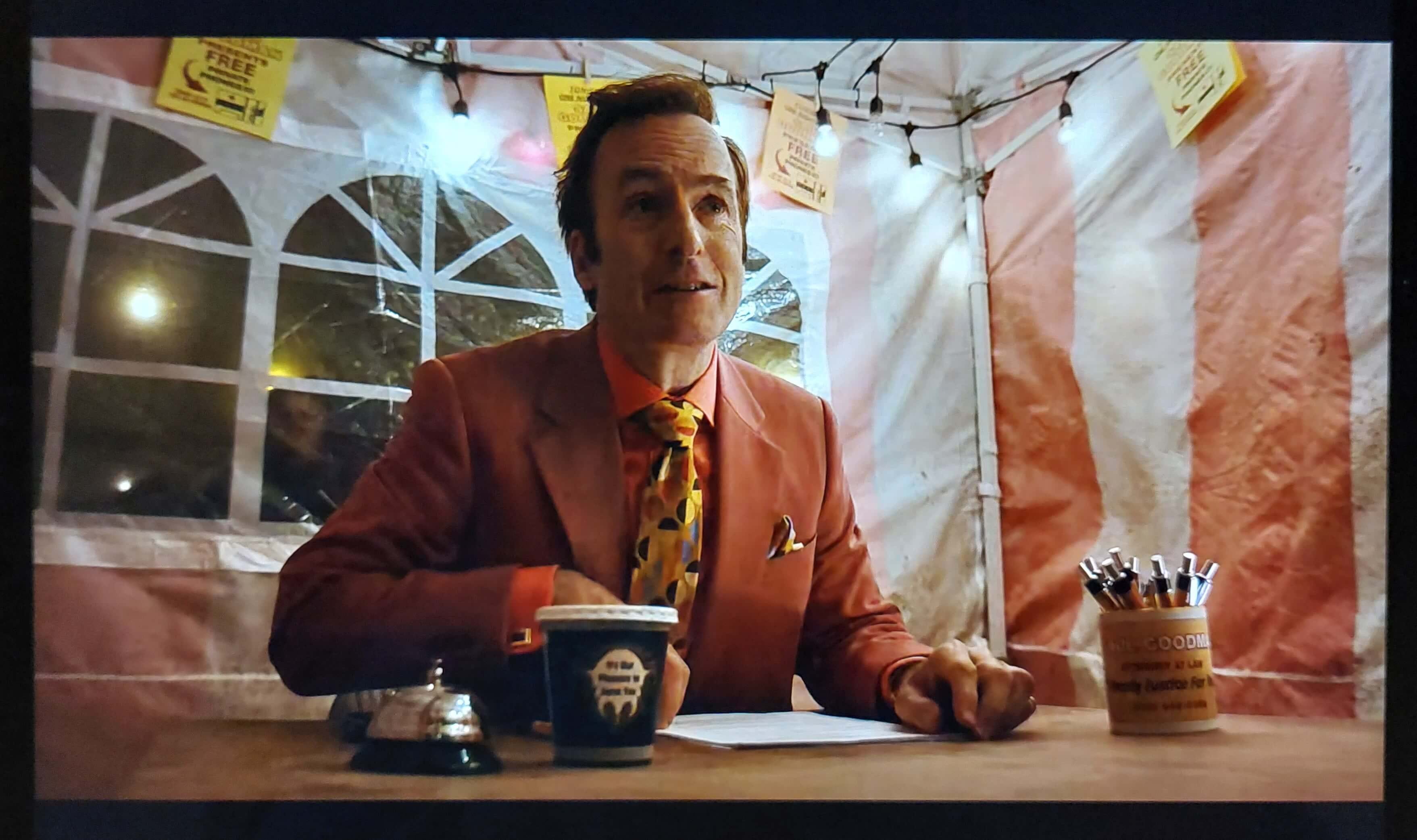
I was always fascinated by the variety of different suits Saul wears throughout the show and wondered why on earth he chose to dress like that.
I was also curious about the use of black and white to denote scenes set in the future i.e. after the events of Breaking Bad.
After taking the time to do a deep dive into this topic there was a boatload of stuff I completely missed regarding color. It's really had an impact on how I think about watching TV shows going forward.
I find myself wanting to re-watch the show with this new information in mind as it gives a whole new perspective to things.
Learning
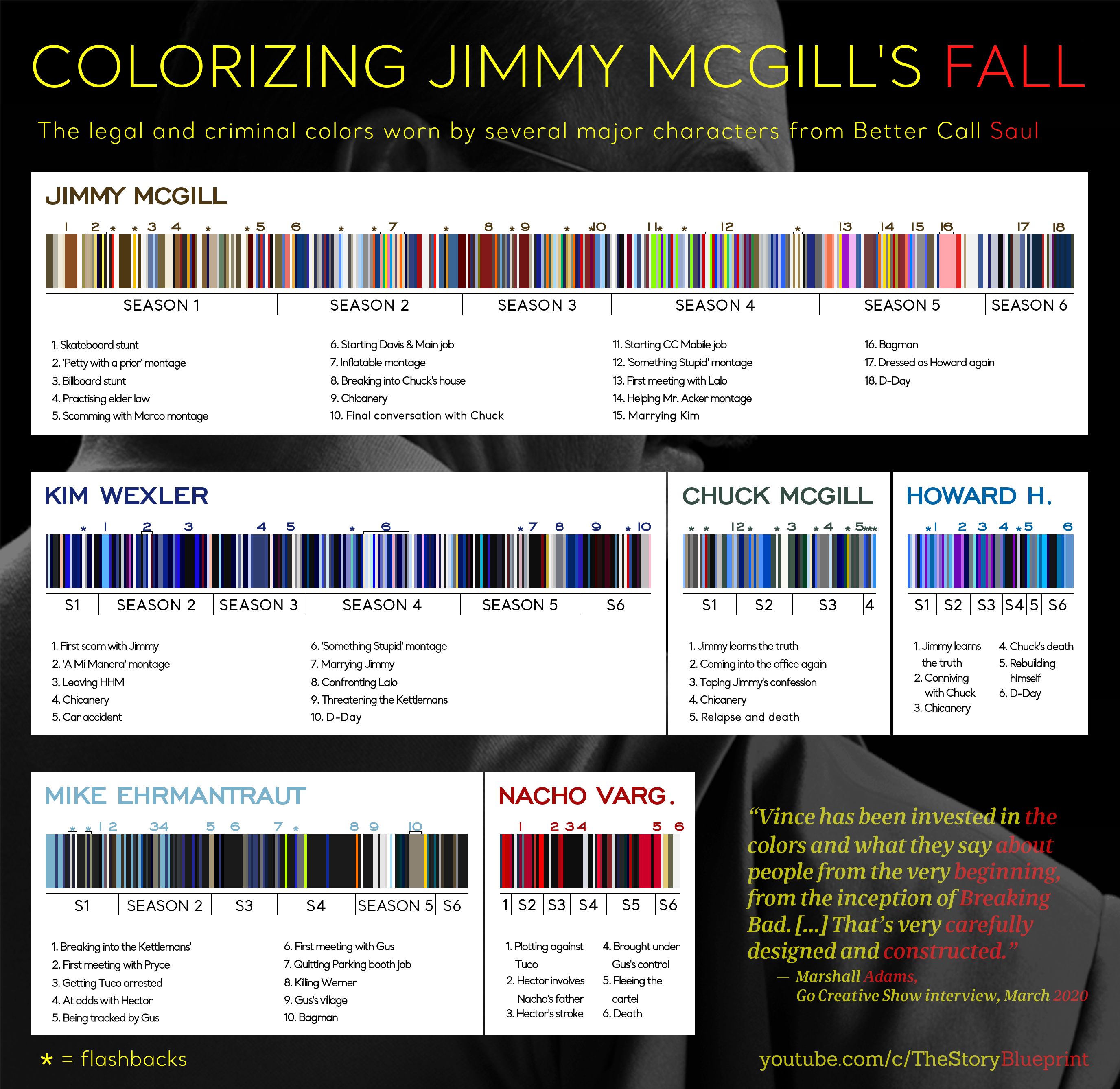
As with Breaking Bad, BCS uses color as an important signifier for the various characters in the show.
The color palette used in BCS is categorized like this:
"Good" characters wear blues, navy, and greens.
"Bad" characters wear reds, oranges, and the colors of the New Mexico desert.
I'm using quotes around good and bad because that's the crux of the whole show: legality vs criminality.
One character isn't solely good or bad, they fluctuate between each state depending on the actions they take.
Jimmy and Kim vary throughout the show. They wear blue in moments when they're on the good side of the law then wear red when they're veering into criminality.
Other characters like Nacho almost always wear red, Don Eladio is gifted a red car, and the interior of Mike's car is red.
This color chart is a fascinating look at the use of color in Better Call Saul and how it's progressed throughout the show:
Any scene of the show that's set in "the future" i.e. after the events of Breaking Bad is shown in black and white.
The creators wanted to hint at the fact that the fun has drained from Saul's life at that point in the future (for reasons I won't go into).
This has such an impact because throughout the rest of the show, and in Breaking Bad, so much of Saul's world is about color. From his garish suits to his colorful ties, to his outlandish shirts.
All this is captured beautifully in this YouTube video which I highly recommend:
Outcome
When you're watching a TV show it's easy to tune out the peripherals, the scenery, the camera position, and even the costumes. Most of the time I'm focused on the story and don't really appreciate the small details.
But take those details away and you notice their absence straight away.
I recently re-watched Fatal Deviation a cult Irish film that's so bad it's good. Plot holes, when there is a plot, strange camera angles, and lots of made-up kung-fu fighting that reminds me of Mac from Always Sunny.
Anyway, looking back through BCS while writing this gave me the chance to look at single shots from various scenes. So many moments were beautifully constructed and each shot could stand on its own as a photo.
This has definitely encouraged me to appreciate what I'm watching. There's more to a TV show or movie than just a story. I now am also looking for little details in the background, the use of color, and even what characters are wearing.
When something strikes me and makes me say "hmm, I wonder what that means?", I quickly jot it down and try to look it up online after. There's so much craft that goes into creating TV shows and it's fascinating to pay attention to the smallest details.
This isn't a review or anything but In a world where all shows, especially Netflix shows, are on the verge of looking the same, I think Better Call Saul breaks that mold and is a really well-told story that's also beautiful and visually interesting to watch.
🔗 Curated Links
A collection of links I found interesting this week:
Please do yourself a favor and watch this video that beautifully reviews the Irish cult movie Fatal Deviation: Ireland's Hilarious Kung Fu Movie - Fatal Deviation (1998) - YouTube
I've gotten into erasable pens recently and bought a ton from this website: Erasable Pens - Legami.com
The Better Call Saul Costume Designer Breaks Down Jimmy McGill's 'Showy' Style
Actual tips for making your spreadsheets look a lot better visually: Fresh Sheets for your spreadsheets: A non-designers guide to upgrading your Google Sheets
If you enjoy reading Design Insight, consider sharing it with someone you think might like it too!
Til next week 👋
Michelle