
How To Write Effective Error Messages
Edition 032 of Design Insight

Hello and welcome back to Design Insight 👋
If you're new here, welcome to our growing community of designers! I appreciate you and truly hope you find lots of value here 🤗
After last week's edition, I decided to open up a form for you to submit your questions for me. If you have any design or productivity related questions you'd like to ask, now's your chance. I may even feature the answer to your question in a future edition.
Here's the link: Ask A Designer
Also, just a heads up, this will be the second last edition of the year. After next week's edition, I will be taking some time off to enjoy the holidays 🎄
Let's get started.
🗃 3 Design Resources
📃 Article - Designing for Long Waits and Interruptions
Source: NNGroup.com
Here's what I learned from reading this article:
Users don't like to wait for things. If they have to wait even a fraction of a second without adequate feedback from the system they will become frustrated and even leave without completing their task.
If the wait time for a process is long enough, users are likely to step away or work on something else until it's completed. This can cause them to forget what they were doing before they stepped away. Good progress indicators should account for this.
Allow a long process to run in the background. This allows users to work on other tasks.
Link To Article: Designing for Long Waits and Interruptions
🔨 Tool - Smooth Shadow
Source: @funkensturm
A comprehensive tool for creating smooth shadows.
🔨 Resource - UX Collective
Source: @uxdesigncc
An excellent resource with curated stories on user experience, usability, and product design.
🎨 2 Design Tips
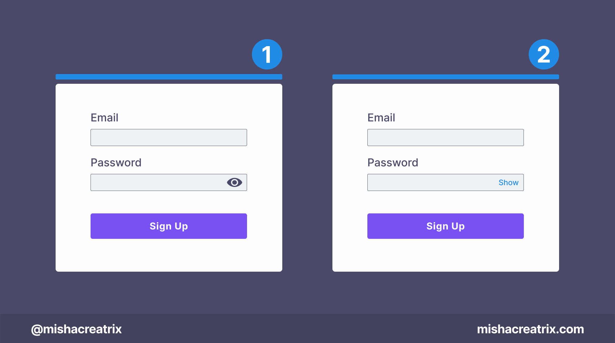
Password Masking - Show Hide Fields
For show/hide password fields, should you use an eye icon or the words show and hide?
There are pros and cons to each so as long as you're consistent with your choice it doesn't matter.
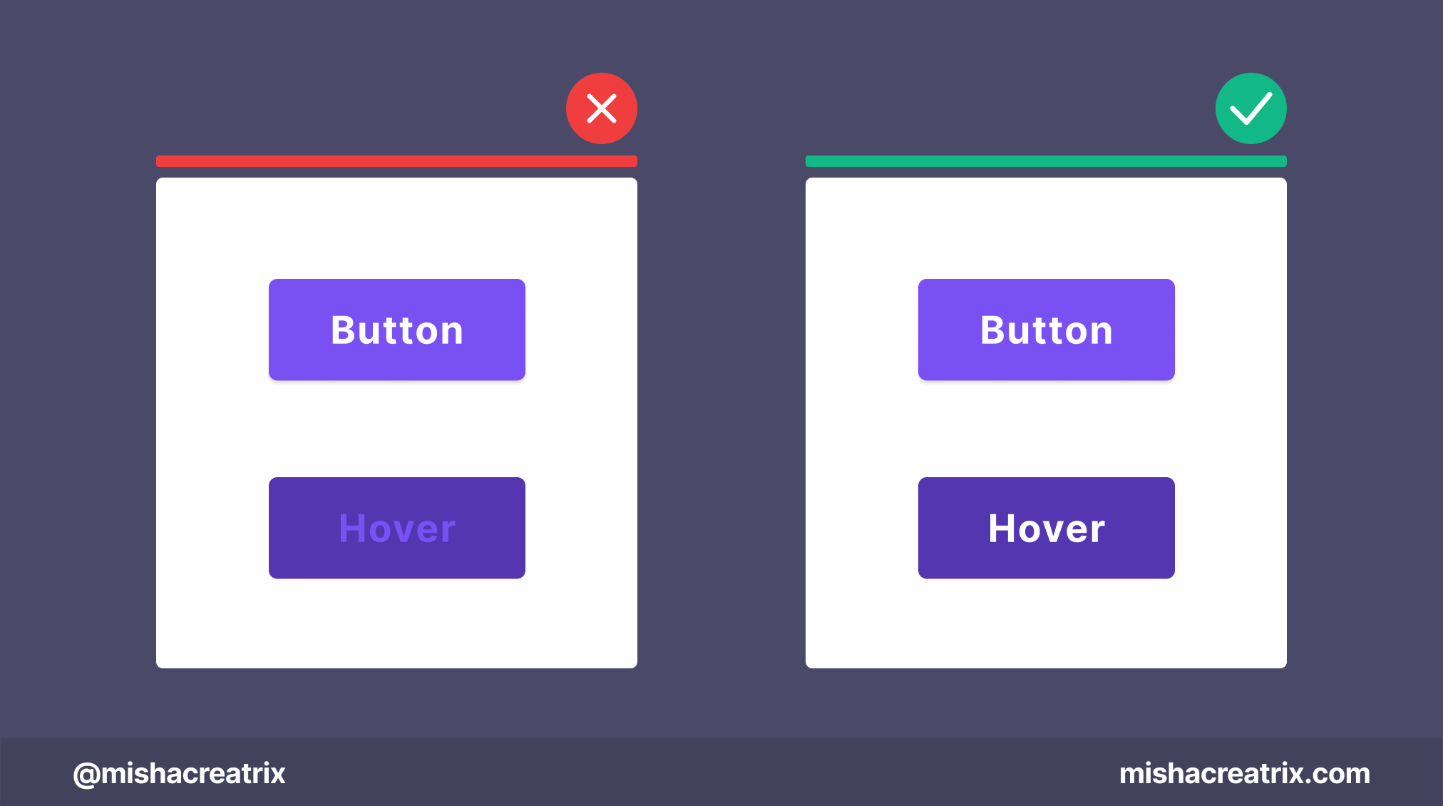
Pay attention to the text color on a button during hover
Keep an eye on the text color of buttons when you hover over them.
Sometimes hovering over a button can cause the text to change to a color that matches the button color for instance.
Hover over your buttons and make sure you can still read them!
📃 1 Article I Wrote
UI Design Patterns - How To Write Effective Error Messages
Any well-designed application should have good error messages.
A good error message will tell the user what happened, why it happened, and how the user can fix it.
Errors will always happen no matter how well you build something. This is because you can’t account for how every single user will interact with your app.
Not every user will follow the happy path. There will be mistakes along the way that are caused either by the user or your app.
That’s why it’s important to consider error handling and how to provide a better experience for your users.
In this article, I would like to share with you the best practices I have learned for writing effective error messages. The article is broken up into a list of guidelines to follow, with each section discussing a particular guideline.
🐦 Top Tweet Of The Week

In case you missed it, here are last week's most popular links:
Want to help support this newsletter? Buy Me A Coffee. Let me know if you’d also like a shout out on the newsletter 🥳
Found the tools and resources in this week's issue helpful? I've packaged all the tools and resources I've mentioned across all editions of Design Insight in one place: Design Insight Tools + Resources
You’ve reached the end of this week’s edition of Design Insight. Thank you for reading, I truly hope you found value in the design insights I shared today.
Til next week 👋
Michelle