
Creative Constraints Are Good For You
Edition 027 of Design Insight

Hello and welcome back to the newsletter 👋
If you're new here, welcome! I appreciate you joining and hope you find lots of value here 🤗
Feel free to leave a comment below if you have any questions. Let me know if there's anything you'd like to see included in this newsletter or something you really enjoy reading here each week.
Let's get started.
🗃 3 Design Resources
📃 Article - The "Gray Dead Zone" of Gradients
Author: Chris Coyier
Source: css-tricks.com
Here's what I learned from reading this article:
When you have a gradient with two colors that pass through the middle of the circle on the color wheel, you get a "grey dead zone" color. This creates an unpleasant gradient.
One way around this is to go around the center with a third color instead of going through the middle.
This is something important to consider when creating gradients. I have experienced this with gradients in the past but didn't realize this was the cause of the problem!
Link To Article: The "Gray Dead Zone" of Gradients
🔨 Animista
Source: @ana108
Animista is a helpful tool for creating and manipulating CSS animations.
This makes creating effective CSS animations very easy and you don't have to memorize any code.
🔨 Shape Divider
Source: @TrueStyleDesign
This free tool allows you to create and export SVG shape dividers.
These components can be useful to include in your web designs to add a fun bit of visual interest.
🎨 2 Design Tips
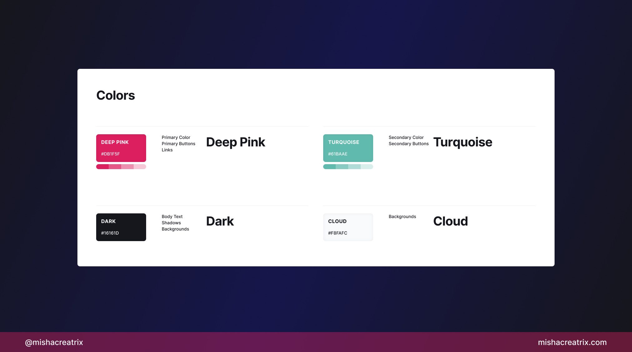
Keep colors consistent
Keep the colors you use in a design consistent.
If you use a pink color for a primary button, use that same pink across all primary buttons.
This will create a sense of visual consistency that will be pleasing to the user.
Create a color palette and refer to it often.
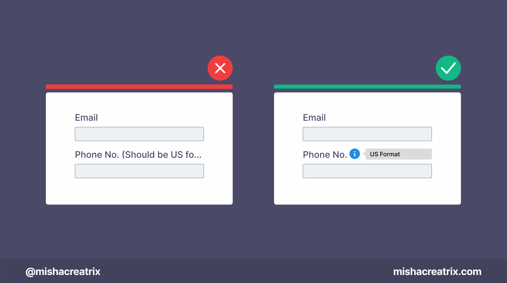
Label text shouldn’t take up multiple lines
Label text shouldn’t take up multiple lines and shouldn't truncate (be cut off).
If you need to provide additional info use a tooltip.
📃 1 Article I Wrote
Creative Constraints Are Good For You

We all need constraints to operate effectively. In the world of creators, creative constraints allow us to focus our energy and concentration in the right place.
Without creative constraints, we become overwhelmed by all the potential choices and decisions we could make. We develop paralysis by analysis and become unable to do anything.
Read the full article here: Creative Constraints Are Good For You
Found the tools and resources in this week's issue helpful? Want even more? I've packaged all the tools and resources I've mentioned across all editions of this newsletter in one place: Design Insight Tools + Resources
If you have something helpful you'd like included in the newsletter, DM me over on Twitter.
If you would like to support my creative work you can do so over on Buy Me A Coffee. Let me know if you’d also like a shout out on the newsletter 🥳
You’ve reached the end of this week’s edition of the Design Insight newsletter. Thank you for reading, I truly hope you found value in the insights I shared today.
Til next week 👋
Michelle