

Edition 021 of Design Insight
Edition 021 of Design Insight
A few lessons in form design, Coolors, CopyPalette, 2 design tips, a walkthrough of my Obsidian setup

Hello and welcome back to the newsletter 👋
If you're new here, thanks for joining, I hope you find a lot of value in what I share here each week 😊
Before we get into it I'd like to mention today is the launch day of my new eBook 🥳🥳
I am incredibly proud of the hard work I put into writing this eBook and thrilled to see it get into the hands of designers and content creators alike.
The eBook is called Design Faster, Design Better and it's all about how to become a productive designer no matter who you are.
If you enjoy the content I share in this newsletter, I'm confident you'll enjoy this eBook too.
Please consider taking a look if you're interested: Design Faster, Design Better - Gumroad
With that said, let's get into this week's newsletter.
🗃 3 Design Resources
📃 Article - A few lessons in form design
Author: Shankar
Source: Medium
Here's what I learned from reading this article:
Think about the loading state of a form. Consider what component you can use to ensure the form doesn't feel stuck or unfriendly. Use a spinner or a loading animation to convey that loading is taking place.
Make error states color-blind friendly. Don't just rely on color to convey a message. Also include an appropriate icon to convey the message: warning, informational, etc.
Don't disable the submit button. This doesn't provide any feedback to the user. They do not know how to enable that button. This adds to the cognitive load of the user. Keep the button enabled so the user can press it and then be shown the errors on the form.
Link To Article: A few lessons in form design
🔨 Coolors
Source: @coolors_co
Coolors is an easy-to-use and very handy color palette generator tool.
It makes the process of creating a color palette for your next design a lot easier and more fun.
🔨 CopyPalette
Source: @d__raptis
CopyPalette is a tool that allows you to generate a Monochromatic color scheme i.e. a color scheme made up of a single color with different tints and shades of that color.
This tool is easy to use and gives you what you need to create a simple color palette without overcomplicating things.
🎨 2 Design Tips
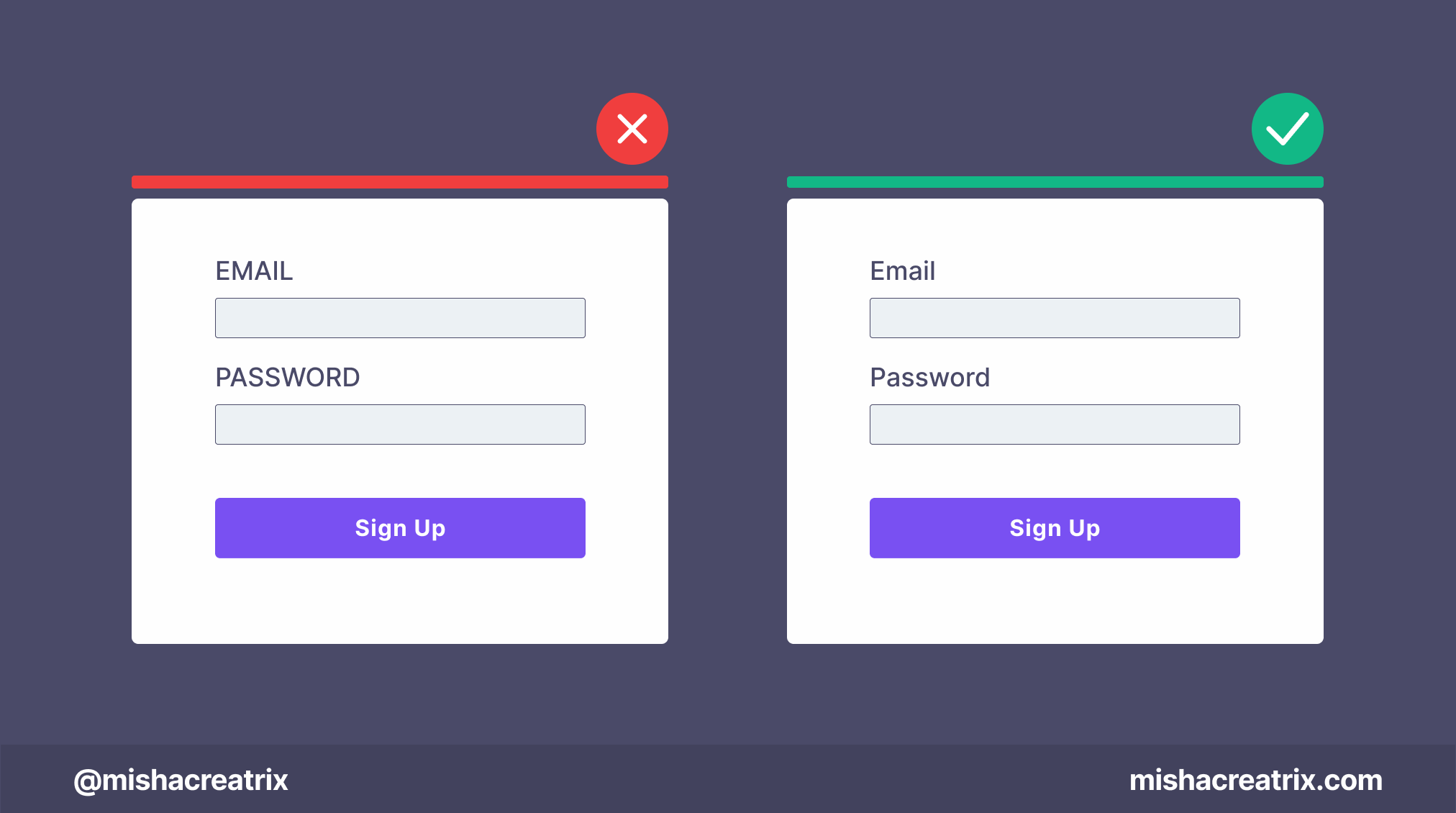
Avoid All Caps On Form Labels
Avoid ALL CAPS on form labels.
All caps text is more difficult to read and slows down scanability.
There's also something about all caps that makes it seem like you are shouting at the user; which you don't want to do.
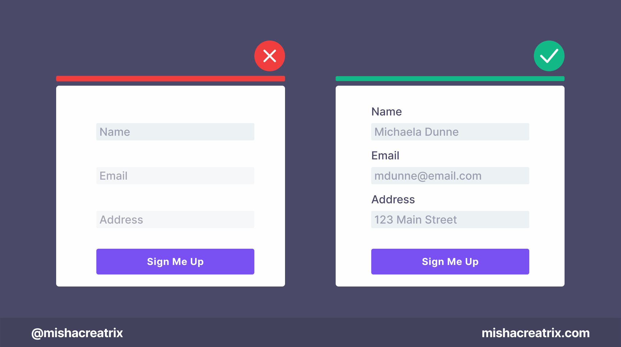
Avoid Using Placeholders As Labels
Avoid using placeholders as labels for form fields.
When the user starts filling in the form field, the placeholder disappears.
The user will quickly forget what information is needed for that field.
Use placeholders for sample content instead.
📃 1 New Article I Wrote
A Walkthrough Of My Obsidian Setup

This week's article is 🔥 and at least 2 weeks in the making.
After fielding a number of questions from people about my Obsidian setup, I finally decided to put together a comprehensive article that showcases how I use Obsidian as a designer, content creator, and productive individual.
It's packed full of screenshots, code snippets, templates, and tips and tricks you can try out for yourself.
Read this week's article to find out how I use Obsidian: A Walkthrough Of My Obsidian Setup
If you have something helpful you'd like included in the newsletter, DM me over on Twitter.
If you would like to support my creative work you can do so over on Buy Me A Coffee. Let me know if you’d also like a shout out on the newsletter 🥳
You’ve reached the end of this week’s edition of the Design Insight newsletter. Thank you for reading, I truly hope you found value in the insights I shared today.
Til next week 👋
Michelle