
Label your icons, Typescale, Unsplash, 2 design tips, UI design patterns - character limits
Edition 018 Of Design Insight

Hello and welcome back to the newsletter 👋
If you’re new here, thank you for joining, and welcome!
Let's get started.
🗃 3 Design Resources
📃 Article - Label Your Icons. No, we can’t read your mind.
Author: Mary Formanek
Source: UX Collective
Here's what I learned from reading this article:
Icons don't have the same meaning for every person. What's more, not everyone understands what they mean. Just because you know that a house icon means 'home' doesn't mean everyone else knows this convention.
Where icons are concerned, there are no laws or standards in place for what icon to use where. This means that one icon could have several meanings depending on the context of where they're used.
A good user experience is one that doesn't require too much thought from the user. They should immediately know how to interact with an app or website. With that in mind, adding a label next to an icon will immediately remove confusion and make it easier to understand.
Link To Article: Label Your Icons. No, we can’t read your mind.
🔨 Typescale
Source: @jeremybchurch
Typescale is a helpful tool I recently came across for creating a typographic scale.
You simply specify parameters like font choice, scale, weight, and base size and you'll see a visual representation of the type scale.
This is really helpful for website design where type hierarchy is used to convey importance and to allow the user to quickly scan a page.
🔨 Unsplash
Source: @unsplash
Unsplash is an excellent free resource for images.
It's the first place I go to when creating cover images for my articles.
🎨 2 Design Tips
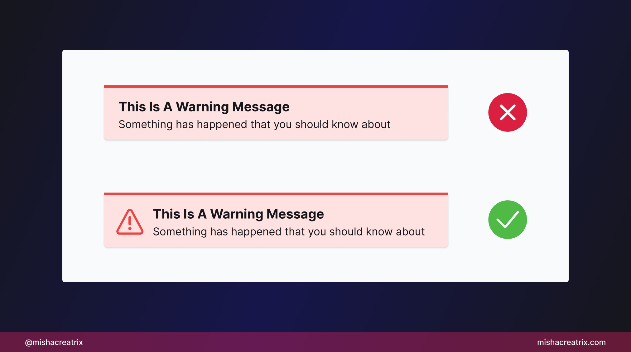
Don't just rely on color to communicate something to the user
Don't rely on color alone to communicate something to the user.
Some users may be colorblind and therefore will miss any inference or signal the UI makes if done with color alone.
Consider additional ways you can convey meaning to the user for example with icons.
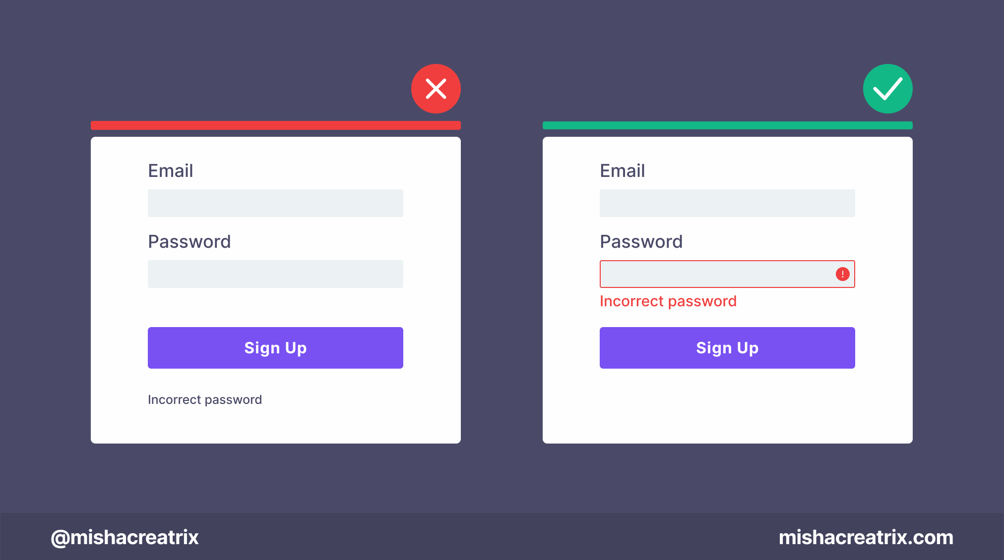
Error messages should be clearly visible
To ensure that the user stays informed about what’s going on, they need to be alerted when something has gone wrong.
The error message should stand out on the screen, either through use the of color contrast, different iconography, a modal window, or some combination of these design patterns.
📃 1 New Article I Wrote
UI Design Patterns - Character Limits
Character limits are used on text fields to indicate the maximum amount of characters that can be entered into that field.
Character limits provide important feedback to the user, so it’s important they are designed correctly.
This week's article is all about character limit components. From how they work to design best practices.
UI Design Patterns - Character Limits
If you have something helpful you'd like included in the newsletter, DM me over on Twitter.
If you would like to support my creative work you can do so over on Buy Me A Coffee. Let me know if you’d also like a shout out on the newsletter 🥳
You’ve reached the end of this week’s edition of the Design Insight newsletter. Thank you for reading, I truly hope you found value in the insights I shared today.
Til next week 👋
Michelle