
Avoid The Urgency Trap With The Eisenhower Matrix, NNGroup, Design Principles, 2 UI/UX Design Tips
Edition 013 of Design Insight

Hello and welcome back to the newsletter 👋
This week's edition will be a bit shorter as there’s no UI/UX review.
I got my first dose of the vaccine this week and it's completely knocked me out.
I hope to be back in action next week but for now, I'm pretty much stuck in bed listening to podcasts 😷
I still hope you find a lot of value in what I've put together for this week's edition.
If you enjoy it, or even if you prefer this shorter format, please let me know in the comments below or over on Twitter.
Let's get started.
📃 3 Design Library Items
Article - Avoid The Urgency Trap With The Eisenhower Matrix
Author: Laura Scroggs
Source: Todoist Blog
Here's what I learned from reading this article:
Humans are bad at prioritizing tasks that will in the long term lead us towards our goals. We tend to focus on the tasks that are the most urgent but not necessarily the most important.
By categorizing your tasks into the 4 quadrants of the Eisenhower Matrix, you can see where you are spending your time and work towards tasks that provide you with the most personal growth.
A weekly review is an important tool to reflect on the week, see how you have spent your time, and plan for the next week.
Link To Article: Avoid The Urgency Trap With The Eisenhower Matrix
NNGroup
The Nielsen Norman Group website is a great resource for learning about user experience.
As the name might suggest, this site was founded by UX veterans Jakob Nielsen and Don Norman.
I highly recommend bookmarking this resource and reading a few articles a week to build your UX knowledge.
Design Principles
Design Principles is a site dedicated to, as you might have guessed, design principles.
The website holds a vast collection of different types of design principles. From principles of rich web apps to principles of good road design.
There's a lot to learn from this website so it's another great resource I recommend.
🎨 2 UI/UX Design Tips
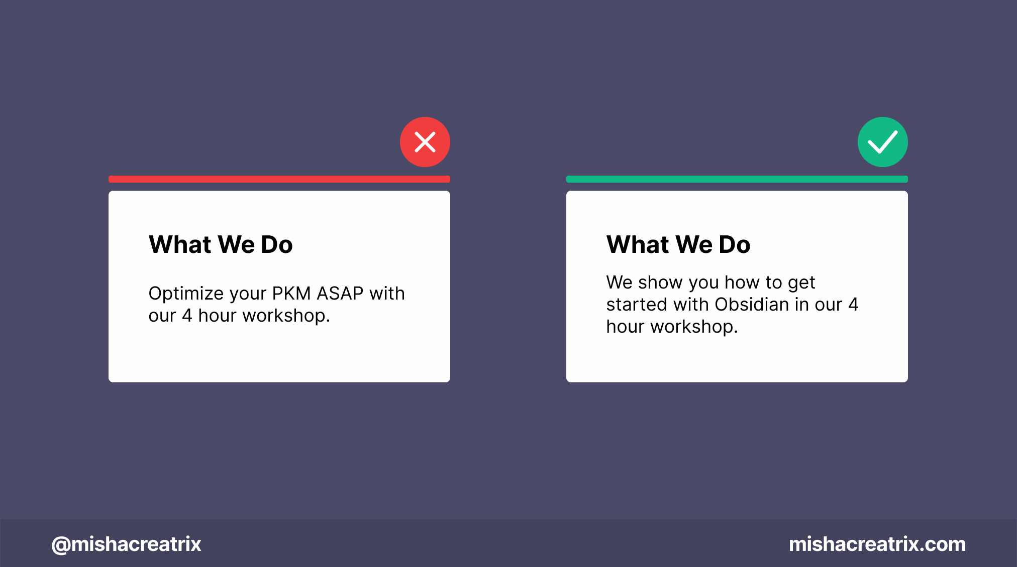
Use simple language instead of complicated buzzwords
Use simple language instead of complicated buzzwords.
Don't assume your audience understands complicated terminology that relates to your industry/niche.
Make things easy enough for a 5-year-old to read and understand.
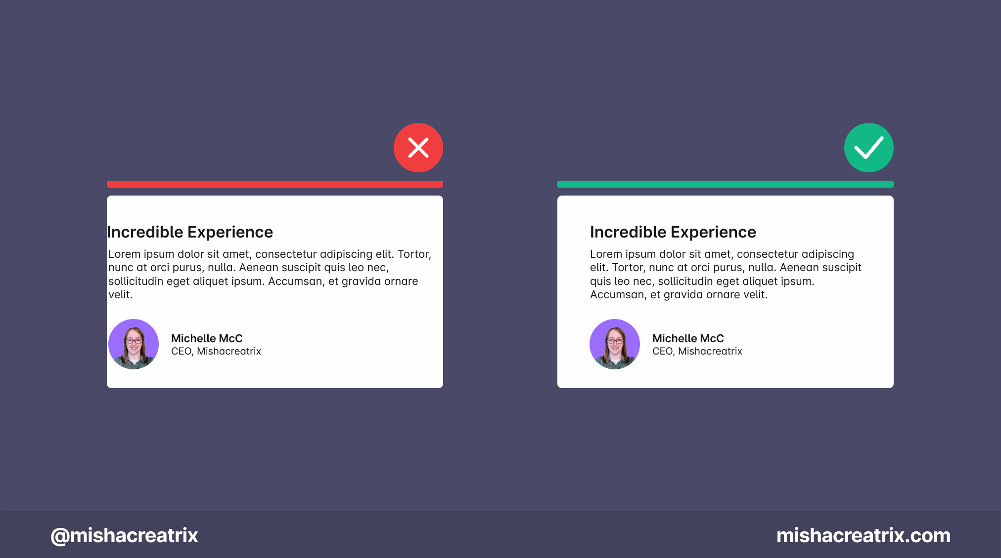
Use padding so your content doesn't hit the edge of the screen
Use containers/padding so your content doesn't hit the edge of the screen.
This makes text easier to read.
It also creates a sense of alignment and consistency which leads to a more pleasing design.
If you have something helpful you'd like included in the newsletter, DM me over on Twitter.
If you would like to support my creative work you can do so over on Buy Me A Coffee. Let me know if you’d also like a shout out on the newsletter 🥳
You’ve reached the end of this week’s edition of the Design Insight newsletter. Thank you for reading, I truly hope you found value in the insights I shared today.
Til next week 👋
Michelle